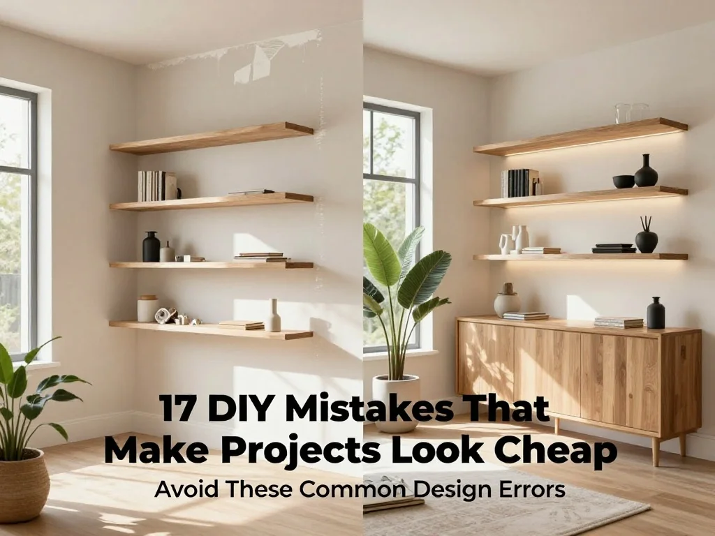
17 DIY Mistakes That Make Projects Look Cheap
Introduction
Have you ever finished a DIY project only to feel like something still looks off? Many of the mistakes that make DIY projects look cheap have nothing to do with budget and everything to do with the small details that influence the final result.
The good news is that creating a polished, designer-inspired look is often easier than most people think. From paint finishes and hardware choices to styling and proportions, a few thoughtful adjustments can completely transform how a project is perceived. I’ve noticed that the most impressive DIY makeovers usually aren’t the most expensive ones—they’re the ones where extra attention is given to the finishing touches. In this guide, you’ll discover common mistakes that can make handmade projects feel less refined and learn simple ways to create results that look more professional, timeless, and worthy of saving for future inspiration.
Poor Paint Finish
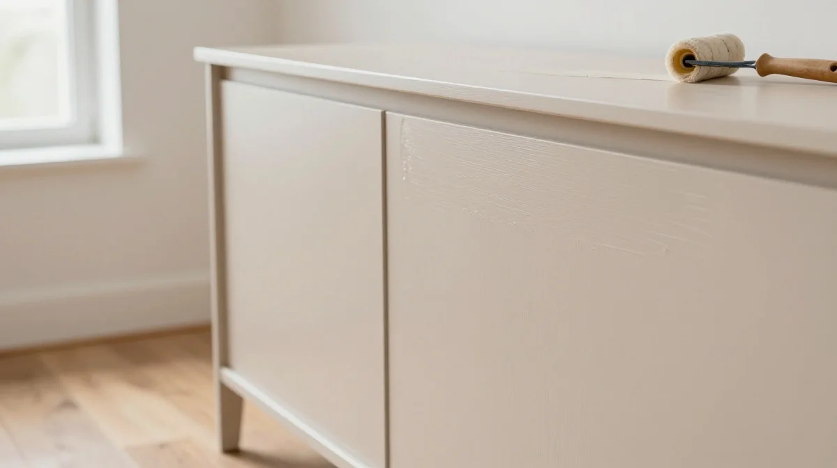
Nothing makes a handmade project look unfinished faster than a rough paint job. Visible brush marks, uneven coverage, drips, and inconsistent color can instantly distract from an otherwise beautiful design. One of the easiest ways to elevate any DIY creation is to treat painting as a finishing skill rather than a final step. Careful surface preparation, quality tools, and patience between coats create a smoother appearance that closely resembles professionally manufactured pieces while helping every detail look cleaner and more intentional throughout the entire project.
A flawless finish creates visual confidence the moment someone enters the room. Smooth surfaces reflect light more evenly, making furniture, decor, and built-ins appear more refined and expensive. In my experience, allowing each coat to dry completely before adding another produces noticeably better results than rushing the process. Taking extra time to sand lightly between coats also helps eliminate imperfections that become highly visible once the project is complete. These small adjustments dramatically improve the final appearance without requiring expensive materials or advanced skills.
Visible Glue Marks
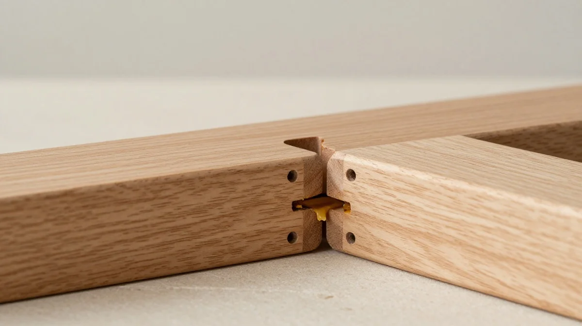
Few details make a project appear lower quality faster than visible glue squeezed out around seams and joints. Excess adhesive catches light, attracts dust, and interrupts the clean lines that give a piece its finished look. While glue is essential for strong construction, it should rarely become a visible design feature. Taking a few extra moments during assembly to wipe away excess material helps preserve the beauty of wood, paint, or decorative surfaces and allows the craftsmanship itself to remain the focal point of the finished project.
Clean construction communicates attention to detail. When joints appear seamless, the project feels more intentional and professionally built. I have noticed that even simple beginner projects look significantly better when assembly areas remain neat and tidy. Using a damp cloth immediately after applying adhesive prevents hardened residue that becomes difficult to remove later. This habit requires very little effort yet contributes enormously to the overall impression. Viewers may not consciously notice the absence of glue marks, but they immediately recognize the cleaner, higher-end result.
Cheap Hardware Choices
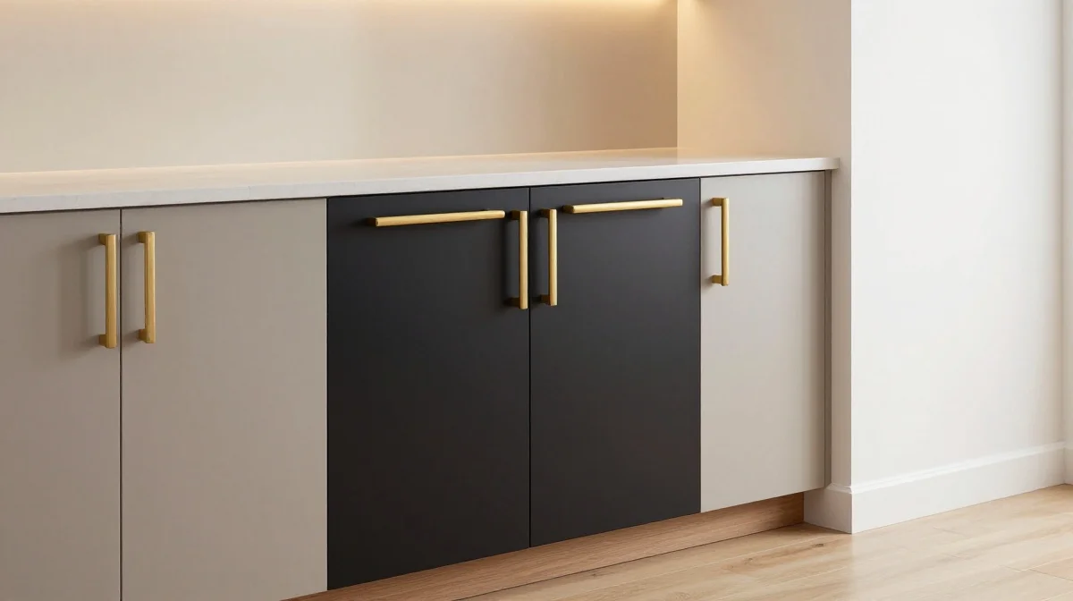
One of the mistakes that make DIY projects look cheap is selecting hardware solely because it costs less. Handles, knobs, hinges, and hooks may seem like small details, but they strongly influence how people perceive quality. Lightweight plastic finishes, mismatched metals, or overly decorative designs can make an otherwise attractive project feel outdated. Investing slightly more in simple, well-designed hardware often creates a dramatic visual upgrade and helps furniture, shelving, and storage pieces feel more custom and thoughtfully designed from every angle.
Hardware influences both appearance and daily usability. A sturdy handle feels substantial in the hand and reinforces the impression of quality each time it is used. I’ve seen this work well in furniture makeovers where replacing old hardware instantly transformed the entire piece. Brushed finishes, matte metals, and timeless shapes tend to age better than trendy options that quickly look dated. Choosing hardware that complements surrounding materials helps create a cohesive result that feels professionally planned rather than assembled from unrelated components.
Mismatched Finishes
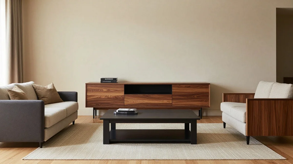
A project can quickly lose its visual impact when too many finishes compete for attention. Combining glossy paint, shiny metal, distressed wood, and highly textured surfaces without a clear plan often creates visual clutter. Instead of feeling curated, the result can appear accidental and disconnected. Creating a limited palette of finishes helps establish cohesion and allows each element to support the overall design. Even simple projects gain a stronger sense of style when every material feels like it belongs within the same visual story.
Consistency helps the eye move comfortably through a space. When finishes complement one another, furniture and decor appear more polished and thoughtfully selected. In my experience, choosing one dominant finish and one supporting accent creates a balanced result without overwhelming the design. This approach works especially well for shelving, furniture makeovers, and decorative accents. Rather than chasing every trend at once, focusing on a cohesive combination of materials produces a cleaner and more timeless aesthetic that remains attractive long after the project is completed.
Crooked Installations
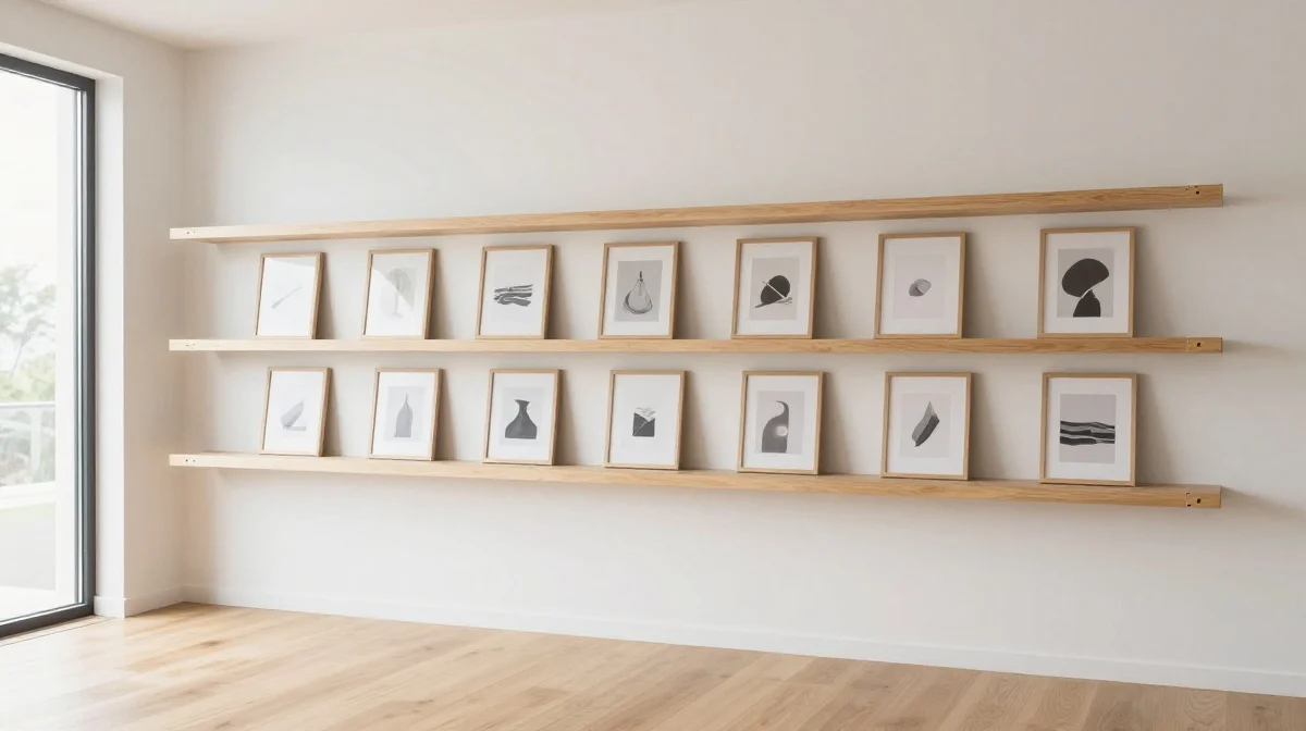
Even beautiful materials can look unprofessional when installed unevenly. Crooked shelves, off-center artwork, tilted hardware, and misaligned trim immediately draw attention for the wrong reasons. Because humans naturally notice straight lines, even minor installation errors become surprisingly visible. Taking time to measure carefully and verify alignment before securing components can dramatically improve the finished appearance. This simple habit helps projects feel intentional, organized, and far more expensive than their actual budget might suggest.
Precision often separates amateur-looking work from polished results. A properly aligned project creates visual order that makes the entire room feel more refined. I’ve noticed that many people focus heavily on materials while overlooking installation accuracy. Yet a modest project installed perfectly often looks better than an expensive one installed poorly. Using levels, measuring tools, and temporary positioning guides helps eliminate guesswork and reduces costly corrections later. The extra preparation may take a few additional minutes, but the improvement in overall appearance is usually dramatic.
Overcrowded Decor
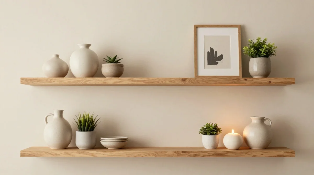
Adding too many decorative elements is one of the mistakes that make DIY projects look cheap because it overwhelms the design rather than enhancing it. When every surface is filled with accessories, individual pieces lose their impact and the overall result can feel cluttered. Carefully edited styling allows important features to stand out while creating a calmer and more sophisticated appearance. Whether decorating shelves, tables, or wall displays, leaving breathing room often produces a stronger visual statement than adding more items.
Well-designed spaces use restraint as effectively as decoration. Strategic spacing allows textures, shapes, and colors to receive the attention they deserve. I’ve seen simple shelf styling transform completely after removing only a few unnecessary items. The remaining pieces suddenly appeared more intentional and visually appealing. This approach also makes seasonal updates easier because there is room to introduce new accents without creating clutter. By focusing on quality placement instead of quantity, DIY projects gain a cleaner, more elevated appearance that feels professionally styled.
Harsh Lighting
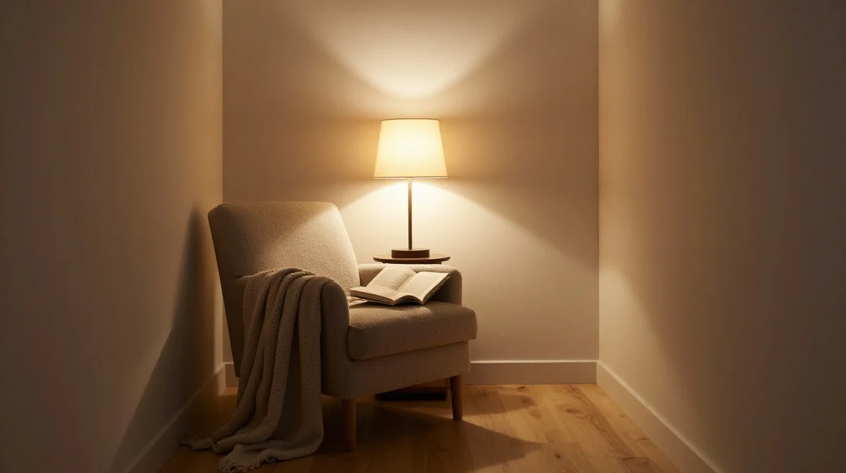
Beautiful DIY work can easily lose its appeal under harsh lighting. Bright overhead fixtures often create strong shadows, expose minor imperfections, and flatten the visual depth of a space. Even carefully crafted furniture and decor may appear less refined when illuminated poorly. Layering different light sources helps distribute brightness more evenly while creating a softer and more inviting atmosphere. Table lamps, sconces, and accent lighting can reveal textures and finishes in a way that makes projects feel more polished and thoughtfully presented.
Lighting influences how every material and color is perceived. Warm illumination often makes wood tones richer, fabrics softer, and painted surfaces more sophisticated. In my experience, improving lighting frequently has a bigger visual impact than purchasing additional decor. A well-lit project feels intentional because details become easier to appreciate without overwhelming the room. Strategic lighting also adds depth that helps spaces appear more expensive and professionally designed. When viewers notice the project itself instead of distracting glare or shadows, the craftsmanship receives the attention it deserves.
Rushed Surface Prep
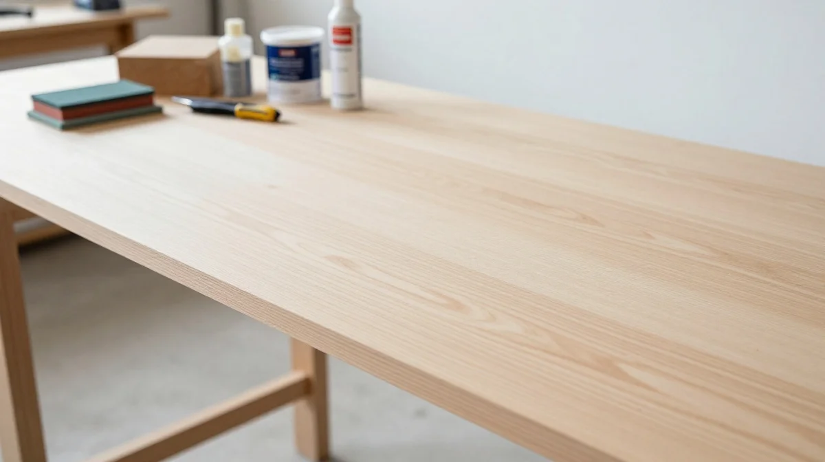
Many disappointing DIY results can be traced back to skipped preparation steps. Painting over dust, ignoring dents, or applying finishes to rough surfaces usually creates problems that remain visible long after the project is complete. While preparation may not be the most exciting stage, it provides the foundation for everything that follows. Taking time to clean, sand, repair, and prime surfaces helps ensure that finishes look smoother and last longer while creating a noticeably more professional appearance.
Surface preparation affects both beauty and durability. Projects that begin with a solid foundation tend to perform better over time and maintain their appearance longer. I have noticed that beginners often underestimate how much preparation influences the final outcome. Even premium materials struggle to compensate for poorly prepared surfaces. By investing effort early in the process, you reduce the likelihood of visible flaws and costly corrections later. This attention to detail allows every subsequent step to look cleaner, sharper, and more refined from start to finish.
Ignoring Scale
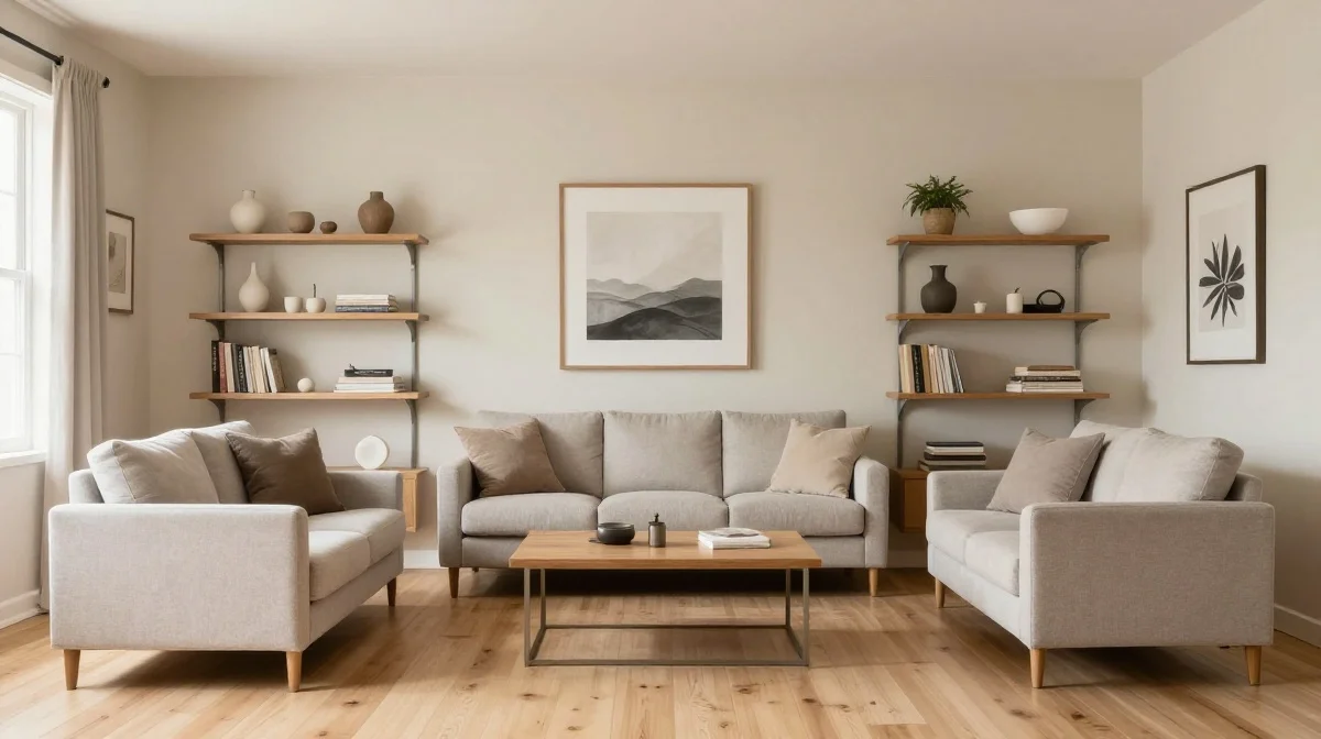
A common design mistake occurs when project dimensions fail to match their surroundings. Oversized shelves, tiny wall art, or bulky decorative pieces can disrupt visual balance and make a room feel awkward. Scale plays a major role in how polished a space appears because proportions influence comfort and harmony. Before building or styling any project, it helps to consider how the finished piece will relate to nearby furniture, architectural features, and available space.
Well-proportioned projects naturally feel more professional because they complement rather than compete with their environment. I’ve seen this work especially well when people use painter’s tape or temporary mockups to visualize size before building. This simple technique helps prevent costly mistakes and improves confidence during planning. Thoughtful proportions allow every element to contribute to a cohesive design rather than becoming a distraction. When scale feels balanced, DIY creations blend seamlessly into the room and create the appearance of a carefully curated interior.
Busy Color Schemes
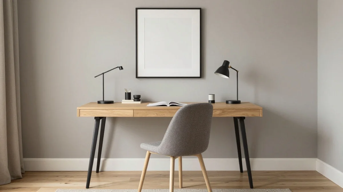
Too many competing colors can make even well-built projects appear chaotic. When every element demands attention, the overall design loses focus and visual balance. A restrained color palette helps create a polished look by allowing materials, textures, and craftsmanship to take center stage. Whether working on furniture, wall decor, or room accessories, selecting complementary shades often produces a more cohesive result. Simplicity does not mean boring; it means giving each color a clear purpose within the design.
Color harmony influences how expensive a project feels. Spaces with coordinated tones often appear calmer, cleaner, and more thoughtfully planned. In my experience, choosing a primary color, a secondary supporting shade, and one accent color creates enough variety without overwhelming the eye. This approach makes styling easier and helps future additions blend naturally into the space. By reducing unnecessary color competition, DIY projects gain a timeless quality that remains attractive even as design trends continue to evolve.
Exposed Fasteners
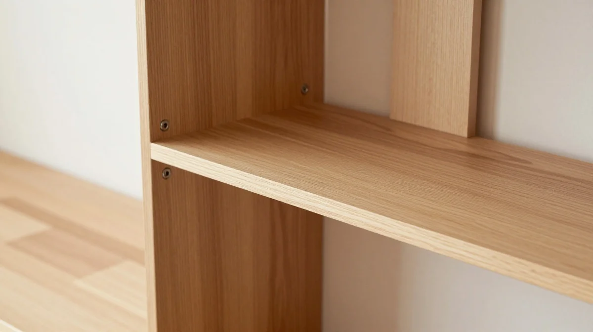
Visible screws and poorly placed nails can interrupt the beauty of an otherwise attractive project. While structural fasteners are necessary, leaving them fully exposed often draws attention away from the design itself. Fortunately, there are many ways to create a cleaner appearance through strategic placement, wood plugs, filler, or concealed fastening methods. These small finishing details help projects appear more refined and custom-built without requiring advanced woodworking expertise.
Professional-looking craftsmanship often comes down to subtle details. When hardware blends into the design, viewers focus on shape, texture, and overall construction rather than assembly methods. I’ve noticed that even inexpensive materials appear higher quality when fasteners are hidden effectively. This approach creates cleaner visual lines that contribute to a more sophisticated result. Taking a little extra time during assembly can dramatically improve the final presentation and help handmade pieces resemble custom furniture rather than simple weekend projects.
Uneven Staining
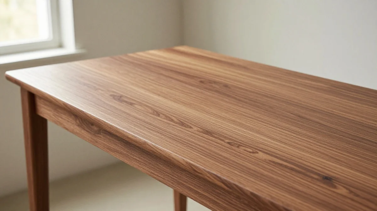
Wood stain can add warmth and character, but uneven application often produces a patchy appearance that looks unfinished. Areas that absorb stain differently may create distracting dark spots or inconsistent coloration. Proper sanding, surface cleaning, and testing on sample pieces help minimize these issues before they become permanent. A carefully applied stain enhances the natural grain while creating a richer and more refined appearance that elevates the entire project.
Consistent coloration helps wood surfaces appear professionally crafted and visually balanced. I’ve seen many furniture makeovers improve dramatically simply by spending more time on preparation and application techniques. Allowing stain to absorb evenly and wiping excess product carefully creates a smoother final result. Patience during this stage pays off because stain often becomes one of the most visible elements of a project. When color looks uniform and intentional, the entire piece gains a stronger sense of quality and craftsmanship.
Thin Materials
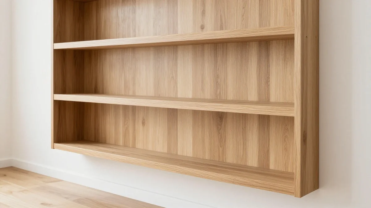
Material thickness has a major influence on how a finished project is perceived. Shelves that sag, tabletops that flex, or trim that appears flimsy can make even attractive designs feel inexpensive. Choosing materials with appropriate thickness helps create a stronger visual presence while improving structural performance. The result is a project that not only looks better but also feels more substantial and reliable during everyday use.
Quality is often communicated through visual weight. Furniture and decor built from appropriately sized materials tend to appear more durable and professionally crafted. In my experience, slightly upgrading material thickness can transform the entire impression of a project without dramatically increasing the budget. Stronger construction also reduces future maintenance concerns and helps pieces retain their appearance over time. When a project feels solid and well-built, it naturally conveys greater value and craftsmanship.
Poor Edge Details
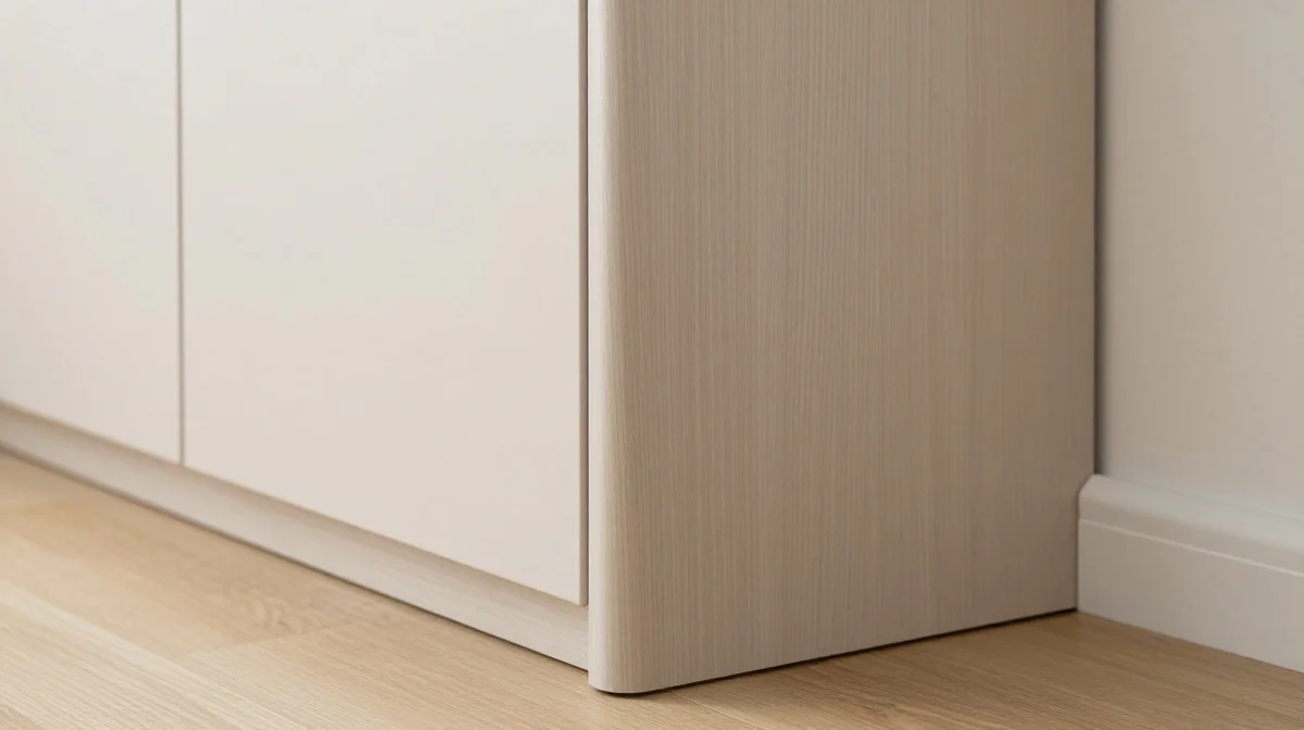
Raw edges and unfinished corners can make a project feel incomplete, even when the overall design is attractive. Exposed particle board, rough cuts, and uneven edge treatments often stand out immediately. Taking time to finish visible edges with trim, sanding, paint, or edge banding creates a cleaner and more professional result. These details may seem minor during construction, but they have a significant impact on the finished appearance.
Well-executed edge details help projects look custom-made rather than quickly assembled. I’ve noticed that viewers often associate smooth edges and clean transitions with higher-end furniture because they signal attention to detail. Finishing edges also improves durability by protecting vulnerable surfaces from wear and damage. This combination of visual refinement and practical performance makes edge treatment one of the most valuable finishing steps in many DIY projects. The improvement is often noticeable immediately after completion.
Trend Overload
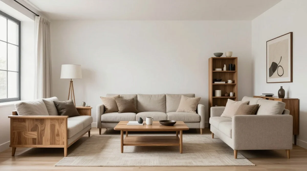
Following every design trend at once can quickly make a project feel busy and dated. Popular styles often change rapidly, and combining too many trend-driven elements may reduce the longevity of a design. Instead of incorporating every current idea, focus on a strong foundation of timeless materials and shapes. A few carefully chosen trend accents can add personality while preserving flexibility for future updates.
Balanced design tends to outlast short-term decorating fads. I’ve seen this work well when homeowners invest in classic finishes and then refresh smaller accessories as trends evolve. This strategy keeps spaces feeling current without requiring major renovations or complete redesigns. Thoughtful restraint helps projects maintain their appeal over time while reducing the risk of visual overload. By blending timeless choices with selective modern touches, DIY creations achieve a look that feels fresh, sophisticated, and enduring.
Skipping Final Styling
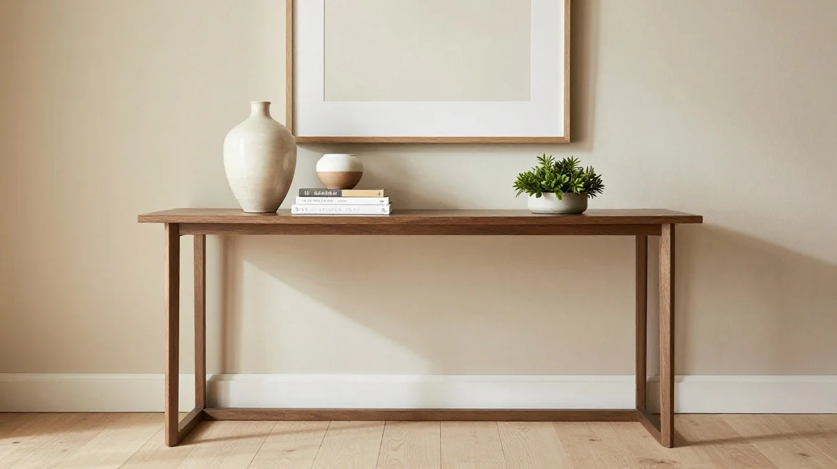
A well-built project can still feel unfinished if it is not styled thoughtfully. After construction is complete, many people stop before adding the small details that bring a piece to life. Decorative objects, greenery, artwork, and carefully chosen accessories help showcase the project while connecting it to the surrounding space. These finishing touches create context and allow the design to feel intentional rather than isolated within the room.
Presentation plays a powerful role in perception. I’ve noticed that even simple projects look significantly more refined after a few minutes of thoughtful styling. The goal is not to fill every available surface but to create balance and visual interest. Carefully selected accessories help highlight textures, colors, and proportions while making the space feel welcoming and complete. A project that is styled well often appears more expensive because it feels integrated into a professionally designed environment.
Ignoring Maintenance
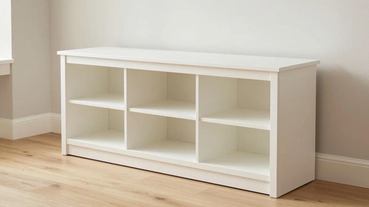
Many DIY projects look great initially but lose their appeal quickly when long-term maintenance is overlooked. Delicate finishes, unprotected surfaces, and difficult-to-clean materials can show wear faster than expected. Planning for everyday use helps preserve both appearance and functionality. Protective coatings, durable materials, and practical design decisions ensure that a project continues looking attractive long after completion rather than deteriorating within months.
True quality is measured not only by how a project looks on day one but also by how it performs over time. I’ve seen this work well when builders choose finishes designed for the specific demands of the space. A durable topcoat on furniture or proper sealing on decorative surfaces can make a remarkable difference. These decisions help prevent damage, reduce upkeep, and maintain a polished appearance. Projects that age gracefully naturally feel more valuable and professionally executed.
Conclusion
Beautiful DIY projects are rarely about spending more money. They are about making intentional choices, paying attention to details, and taking the time to finish each step properly. By avoiding the mistakes that make DIY projects look cheap, you can create furniture, decor, and home upgrades that feel polished, stylish, and professionally designed. Even small improvements in preparation, styling, materials, and finishing techniques can have a dramatic impact on the final result. Save these ideas on Pinterest for future projects, share them with fellow DIY enthusiasts, and start applying them today. I’ve seen how small changes like these can completely transform a space.