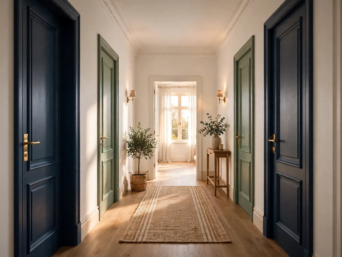
25 Interior Door Color Ideas to Match or Contrast Walls
Introduction
Doors take up more wall space than most people notice, which makes their color one of the fastest ways to change a room. White is a fine choice, but it is only one choice. These interior door color ideas cover both directions: matching your walls for calm, or contrasting them for character.
The right answer depends on how many doors you can see at once, your wall and trim colors, and the light in the room. A hallway with five doors needs a calmer plan than a single pantry door that can carry a bold moment.
Test before you commit. Paint one door, live with it in morning and evening light, and work safely: ventilate well, follow paint maker instructions, and use extra caution with old painted doors in pre-1978 homes, where lead paint may be present.
1. Match Doors Exactly to Walls for a Calm, Seamless Look

Painting doors the same color and a similar sheen as walls makes them visually recede, which suits small rooms, low ceilings, and hallways crowded with doors. The architecture quiets down and furniture and art take the attention instead.
This match approach is sometimes called color drenching when trim joins in too. Use a durable door suitable finish, because doors take knocks that walls do not. Matching works especially well in a single strong color, where white doors would break the spell with bright stripes.
2. Go One Shade Deeper Than the Walls
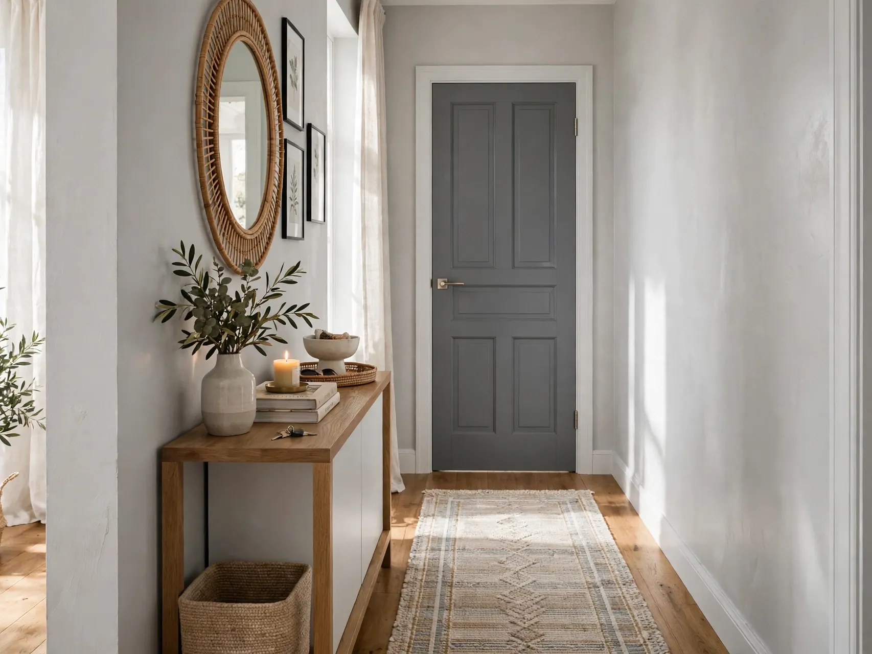
A door one or two shades deeper than the wall color gives gentle definition without true contrast. It reads as shadow and depth, so it suits traditional rooms and anyone nervous about bold color.
Pick the deeper shade from the same color family as the walls so undertones agree.
3. Choose Classic White Doors With Colored Walls
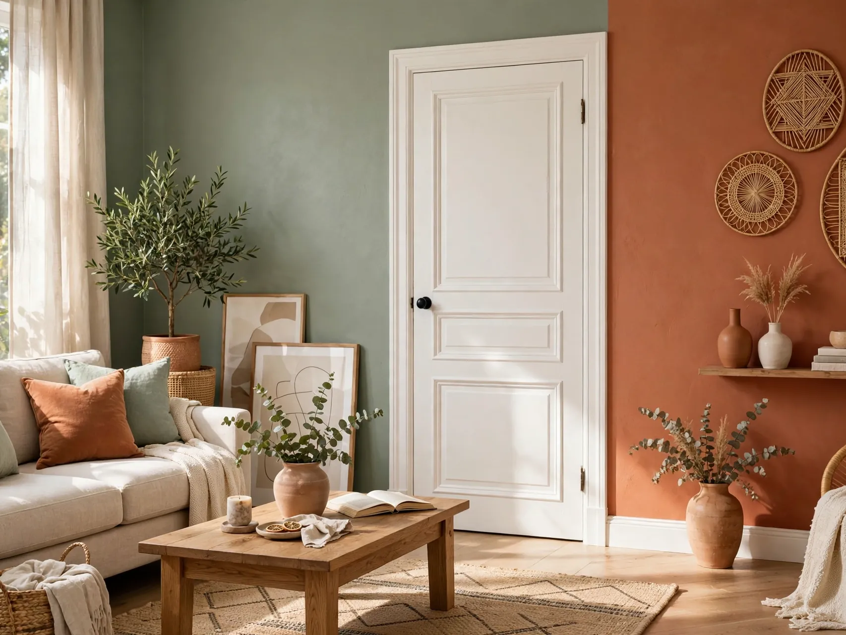
White doors against colored walls remain a classic for a reason: the contrast is crisp, the look suits almost every style, and repainting later is simple. White also unifies doors of different ages and styles across a home.
4. Try Soft Black Doors for Clean Contrast

Soft black, a black softened with a hint of brown or gray, makes doors look architectural against light walls. It hides fingerprints and scuffs better than white, which busy households appreciate, and it pairs naturally with black hardware or light fixtures elsewhere in the home.
5. Pick Charcoal Gray for a Softer Statement

Charcoal gives most of the drama of black with a gentler edge, suiting modern, transitional, and industrial styles. Against white or pale gray walls, charcoal doors look tailored, especially with simple slab or shaker door styles.
6. Use Navy Blue for Timeless Depth

Navy doors carry color with confidence while staying classic enough for resale friendly homes. Navy loves brass or warm metal hardware, white trim, and both warm wood floors and cool gray palettes.
7. Bring in Sage Green for a Calm, Natural Note

Sage green doors bring the garden indoors in the softest way. The muted, gray leaning green calms bedrooms and bathrooms, pairs with warm whites and wood tones, and suits cottage, farmhouse, and modern organic styles alike.
8. Go Deeper With Forest or Emerald Green
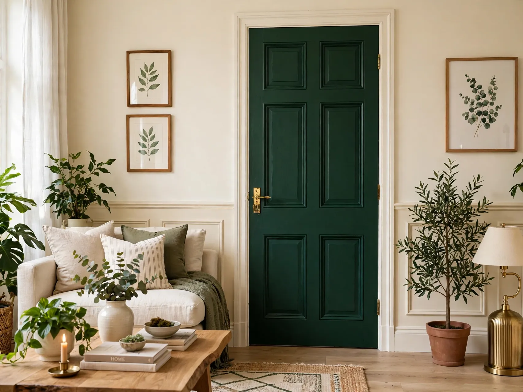
Deep green doors make an entrance of any doorway. Forest and emerald tones suit libraries, dining rooms, and hallways with good light, and they look expensive beside brass hardware and warm wood.
9. Warm Things Up With Greige Doors
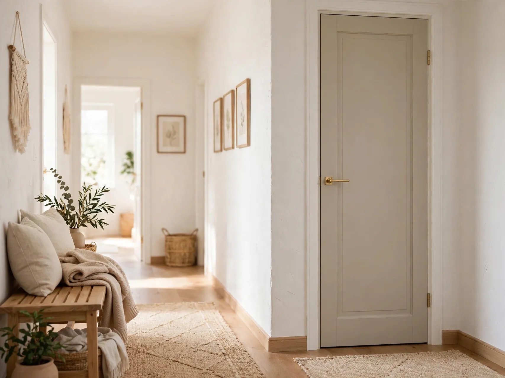
Greige, the blend between gray and beige, is the diplomat of door colors: warmer than gray, calmer than beige, and friendly with both warm and cool rooms. Greige doors against white walls give soft contrast that suits hallways and open plan spaces.
10. Try Warm Taupe or Mushroom Tones
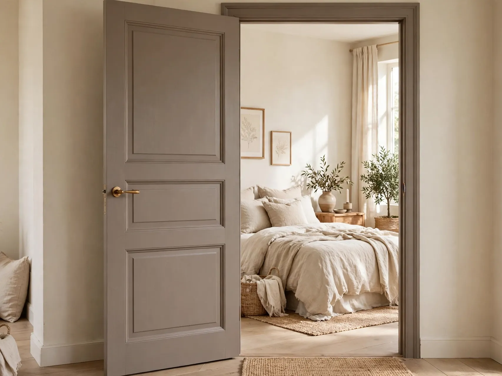
Taupe and mushroom shades, warm mid tone neutrals with a hint of brown or violet gray, make doors feel soft and expensive. They suit bedrooms, living rooms, and any space where black feels harsh and white feels stark.
11. Add Blush or Dusty Pink in Small Doses

A blush or dusty pink door is a joyful surprise in the right spot: a child bedroom, a powder room, a craft room, or the inside of a closet door. Muted, dusty versions read as sophisticated neutrals with warmth, rather than novelty.
Keep the rest of the room simple so the pink door is the single sweet note. Pale pink pairs well with white, warm gray, and light wood. Because taste in pink varies, this is a perfect test one door idea. If you smile every time you pass it, the color has earned its place.
12. Make a Pantry Door the Kitchen Accent

The pantry door is the safest bold door in the house: one door, seen often, in a room that already has color from food, wood, and metal. Deep green, navy, black, or even a warm red can turn a pantry door into the kitchen focal point.
Match or echo a color already in the kitchen, like island paint, a tile tone, or a favorite ceramic, so the door belongs. Add a simple label, a nice knob, or a frosted glass panel if the door has one. Guests always comment on a pantry door done well.
13. Paint the Inside Face of the Front Door

The inside face of a front door is a single, contained canvas that greets you daily. Navy, deep green, black, warm red, or a cheerful mid tone can give an entry personality without changing the exterior look your street sees.
This idea suits renters with permission and homeowners who want low commitment color. Keep the entry walls calm so the door carries the moment. Because the door is seen against daylight when open and lamplight when closed, test the color both ways before painting the final coat.
14. Use Two Tone Doors, Different Colors Each Side
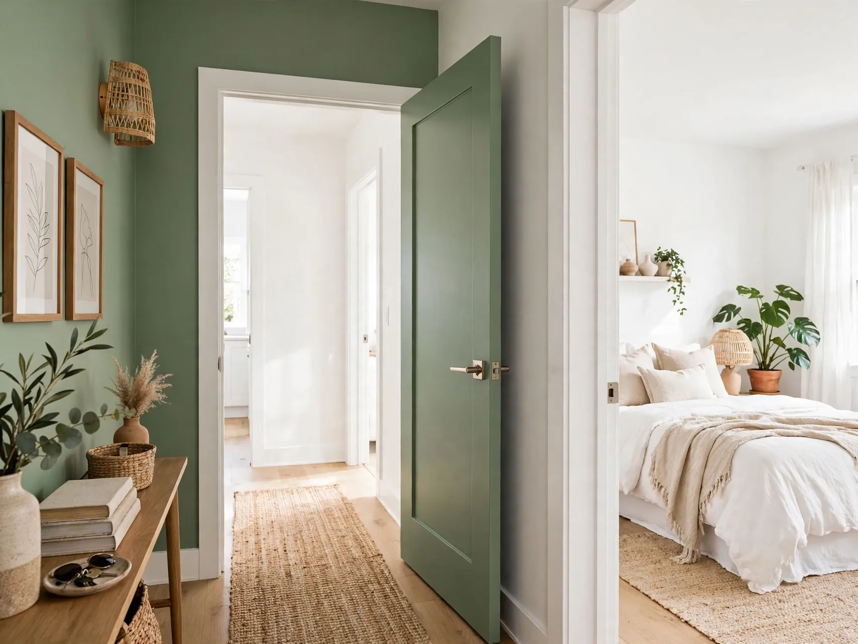
A door has two faces, and they do not have to match. Paint each side to suit the room it faces: calm white toward the hallway, a deeper or playful color toward the bedroom or bath. This solves the common problem of one color suiting only one of the two rooms.
Keep the edge, the narrow strip between faces, in one of the two colors, chosen consistently for all two tone doors. Hardware stays the same on both sides, which ties the trick together. Visitors enjoy the small surprise, and every room gets the door color that suits it best.
15. Color Drench One Room Completely

Color drenching paints walls, trim, and doors in one color for an enveloping, cocoon like room. It suits small studies, powder rooms, media rooms, and bedrooms where mood matters more than brightness. Doors disappear into the walls, making the room feel larger and more unified.
Choose durable finishes for the door within the scheme, and vary sheen slightly between wall and woodwork if the paint maker guidance allows, so surfaces still read as crafted. Drenching in a mid or deep tone is the boldest version; a soft neutral drench is calm and very forgiving.
16. Contrast Doors Against Trim, Not Just Walls
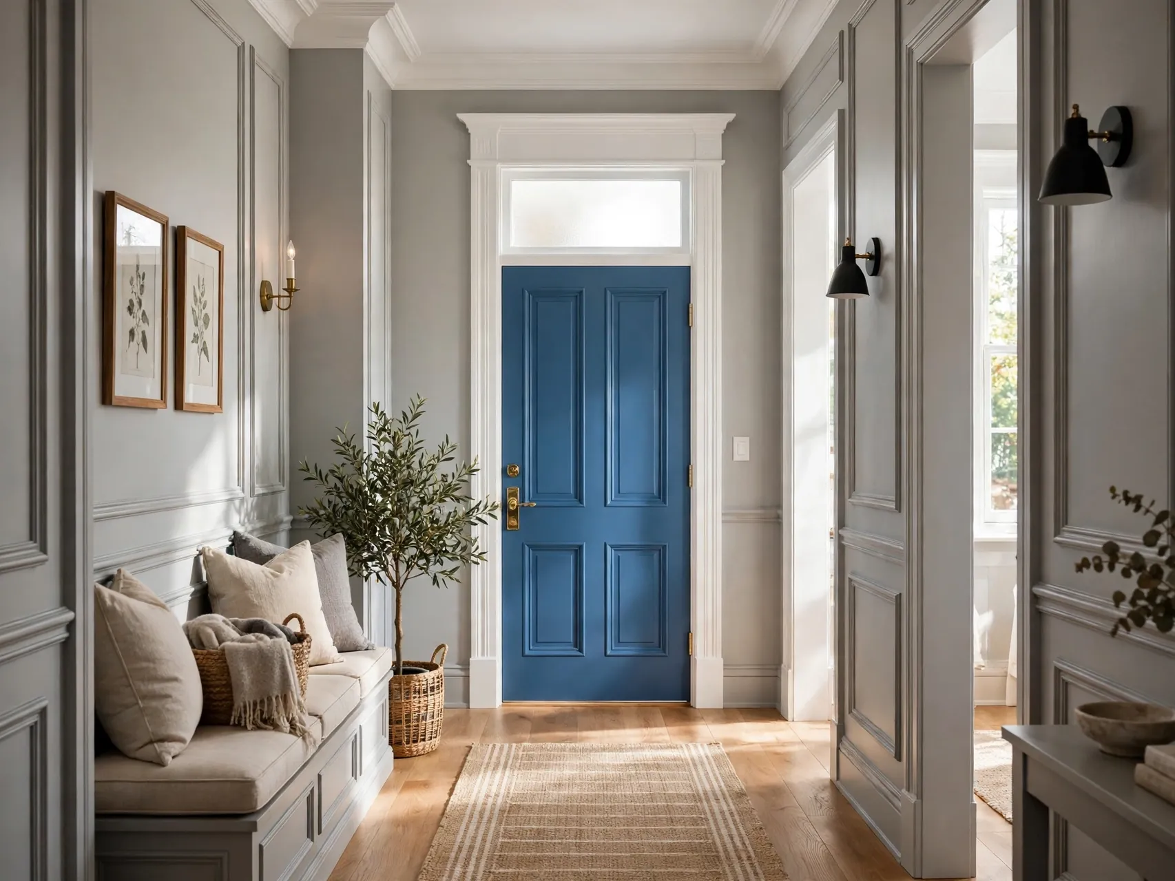
Sometimes the smart contrast is door versus trim. Picture white trim framing a colored door: the trim outlines the door like a picture frame and makes even a soft color look deliberate. This works with sage, navy, charcoal, greige, and most mid tones.
Keep all trim in the room the same color for this to work. The approach also helps when walls are busy or patterned, because the trim gives the eye a consistent border. If you later tire of the door color, repainting one door is an afternoon job, while the trim stays untouched.
17. Keep Doors Light in Dark or Low Light Rooms
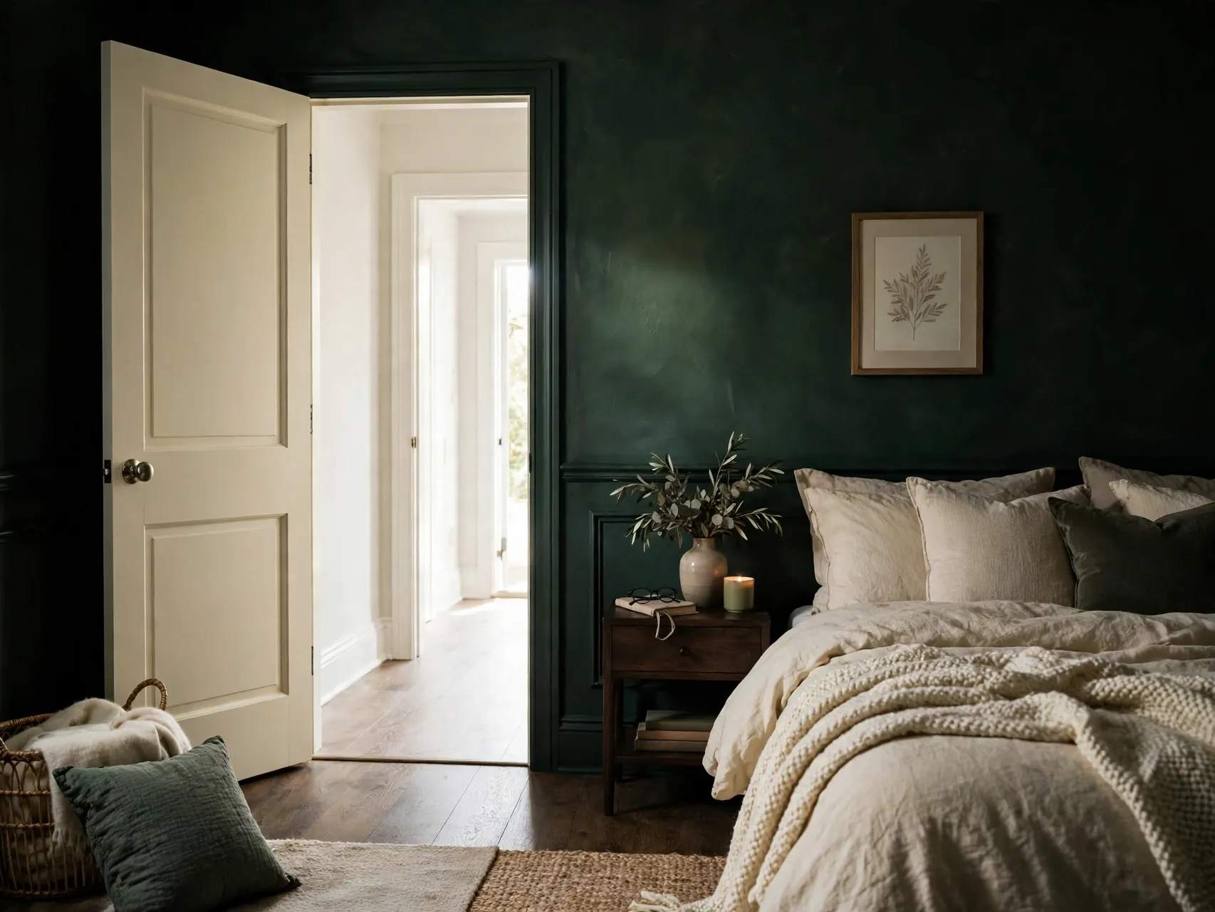
Color rules bend to light. In a basement room, a north facing hall, or any space with small windows, light doors keep the room feeling open and help what light exists bounce around. White, pale greige, or soft cream doors are practical here, not boring.
If you crave color in a dark space, use it on one accent, like accessories or the inside of a closet door, rather than every door face. Test dark door samples honestly at the dimmest hour before ruling them out or in, because paint chips in a bright store lie about dark rooms.
18. Let Natural Wood Doors Add Warmth

Not every door needs paint. Stained or clear finished wood doors add warmth, grain, and texture that flat color cannot, and they suit rustic, traditional, Scandinavian, and mid century styles. Wood also hides wear gracefully in busy family traffic.
Keep wood tones in a home related: similar warmth, even if depths vary, looks collected. If a wood door clashes with floors, a rug between them or a slight stain adjustment on the door can reconcile the pair. Maintain the finish as the maker advises, and enjoy a door that never needs a color decision.
19. Choose a Cheerful Color for a Child Room Door

A child bedroom door can carry the color children beg for and parents fear on four walls. Sunny yellow, soft teal, coral, or a favorite blue on one door gives a room personality that is easy to repaint when tastes grow up.
Involve the child in choosing between two or three parent approved samples painted on the door, because ownership makes them proud of the room. Keep hallway facing paint in mind if the door stands open often. This single door trick delivers most of the joy of a themed room with a fraction of the work.
20. Use Gloss or Higher Sheen as the Contrast

Contrast can come from sheen instead of color. A door painted the same color as walls but in a glossier, durable finish catches light differently and stands out quietly. This suits formal rooms, historic homes, and anyone who loves a subtle, tailored effect.
Higher sheen shows surface flaws more, so preparation matters: clean, fill, sand smooth where safe to do so, and prime as the paint maker directs. Reserve this idea for doors in good condition. The effect is elegant in photos and even better in person as light moves across the door through the day.
21. Paint Closet Doors to Blend or to Feature

Closet doors are often the largest door area in a bedroom, so their color shapes the whole room. Painted to match walls, bifold or sliding closet doors nearly disappear, calming the room. Painted in a contrast color or with simple trim detail added, they become a feature wall.
Matching suits restful bedrooms and small rooms. Featuring suits plain rooms that need one strong element. Either way, use a durable finish and check that paint does not build up on tracks, hinges, or edges where doors slide or fold, so operation stays smooth.
22. Try a Split or Half Painted Door
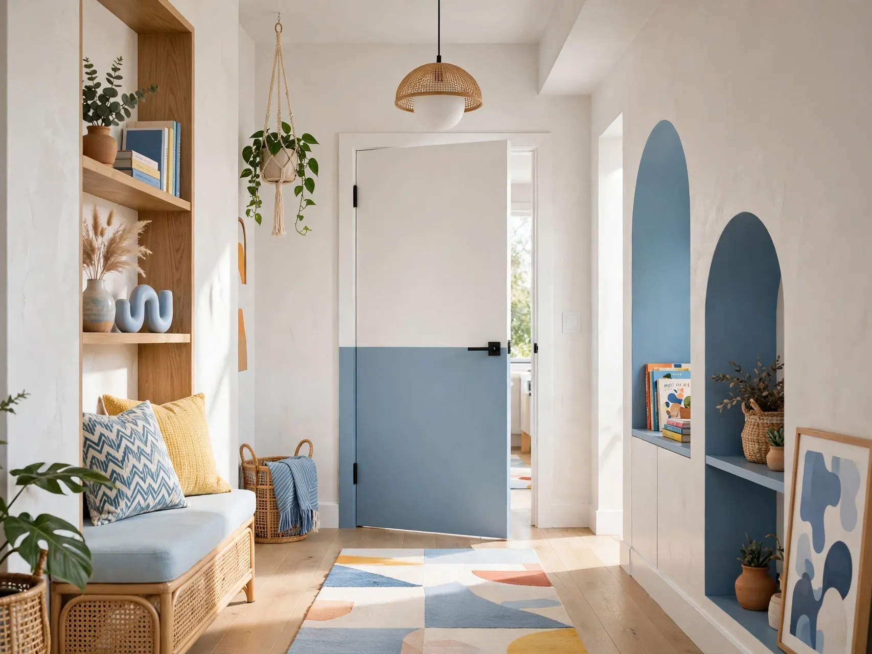
A door painted in two horizontal zones, color below and white or wall color above, or the reverse, adds playful architecture to plain slab doors. It suits children rooms, studios, and modern halls, and it can echo a wainscot line running around the room.
Measure and tape the split carefully, aligning it with trim heights or a rail line in the room so it looks built in, not random. Keep the lower zone in the more durable, darker color, because that is where bags, shoes, and pet paws land. This is a high impact, low paint idea.
23. Coordinate Door Color With Flooring Tone
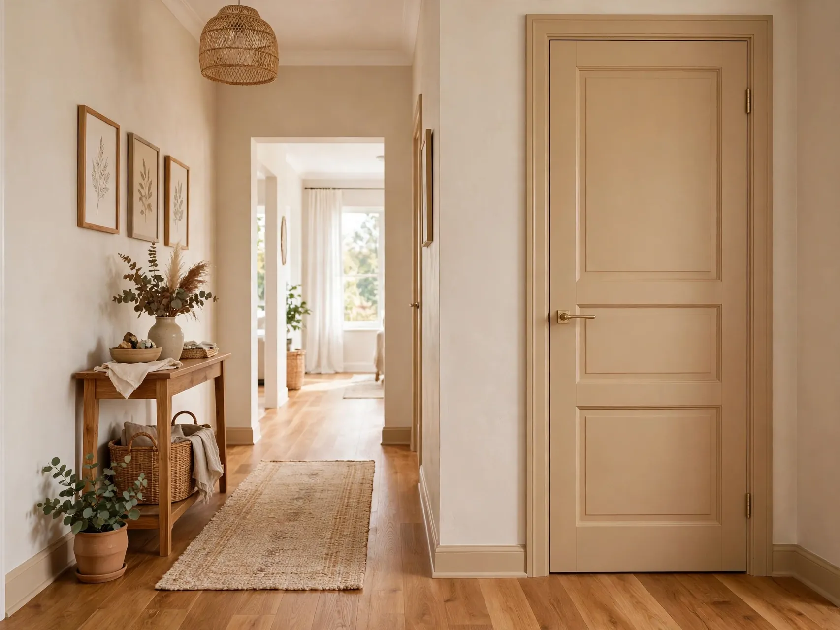
Floors are the largest color field a door stands on, so check door samples against your flooring, not just your walls. Warm floors usually welcome warm door colors, while cool gray floors pair better with cooler doors. A clash at floor level is felt in every photo and every entry.
Lay samples on the floor by the door and view them standing, as you will live with them. Wood floors give you an undertone to echo; tile and carpet give you a dominant color to calm or contrast. This one check prevents the most common door color regret.
24. Repeat One Door Color Through a Sightline

From many rooms you can see two, three, or more doors at once. Repeating one color on all doors in that sightline makes the view feel designed, while mixing several colors in one view usually feels accidental. Plan by sightline, not by room, when doors are open to each other.
This does not mean the whole house must match. A bold color can rule the entry sightline while soft neutrals rule upstairs. Just keep each view coherent. Stand in doorways with samples and look both ways before deciding, because doors belong to two rooms and one view at the same time.
25. Test One Door First, Then Decide the Rest

The most practical of all interior door color ideas is also the simplest: paint one door completely, hardware back on, and live with it for a few days. One finished door tells you more than any chip, photo, or render, in your light, beside your floors, with your furniture.
Choose the door you see most, or the pantry or a bedroom door if you want a low stakes trial. Work safely while you test: ventilate, follow maker instructions, and for pre-1978 homes, follow EPA lead guidance before disturbing old paint. If the test door makes you happy, roll the color out with confidence.
FAQ
Should interior doors match the walls or the trim?
Both can work. Matching doors to trim in a shared color is the classic, tidy choice and frames colored doors neatly. Matching doors to walls makes them recede and suits small or door filled rooms and color drenching. The deciding factors are how many doors share a sightline, your light, and whether you want doors to feature or disappear.
What is the safest first color for a painted interior door?
A muted mid tone like sage green, greige, soft navy, or charcoal is a forgiving first step: colorful enough to feel like a change, calm enough to live with. Start with one door, such as a pantry or bedroom door, view it in morning and evening light, and expand only if you love living with it.
How do I paint an interior door safely?
Work in a ventilated space, keep children and pets out of the work area, and follow the paint maker instructions for preparation, coats, and drying. For homes built before 1978, old paint may contain lead: the EPA advises caution, avoiding dry sanding of suspect paint, and using lead safe practices or a certified professional. When in doubt, test and get advice first.
Do dark interior doors make a room look smaller?
Dark doors add contrast and depth, and in a light room they usually read as architecture rather than shrinking the space. In already dark or small rooms, many dark doors in one sightline can feel heavy, so test one door first. Light walls, good lighting, and repeating a dark accent elsewhere in the room keep dark doors balanced.
Should all interior doors in a house be the same color?
They do not have to match house wide, but doors visible in one sightline usually look best in one color. A practical pattern is one color for main living sightlines, another calm choice for bedrooms, and one accent door where you want a moment, like a pantry or the inside of the front door.
Key Takeaways
- Decide by sightline and light: Plan door colors for the doors you see together, and test samples in your real morning and evening light.
- Match for calm, contrast for character: Wall matched doors recede quietly, while soft black, navy, sage, or greige doors add designed contrast.
- Start with one test door: A pantry, bedroom, or front door inside face is the low risk place to prove a color before painting more.
- Mind floors and trim: Door colors must agree with flooring undertones and sit calmly beside your trim color to look intentional.
- Paint safely, especially in older homes: Ventilate well, follow maker guidance, and follow EPA lead caution for pre-1978 painted doors.
- Inspired to give a door a new color? Save these interior door color ideas to Pinterest and pin the shade you will test first.