21 Bedroom Wall Paint Ideas That Transform the Whole Room
Introduction
Paint is the fastest full room change you can make, and the right bedroom wall paint ideas do more than add color. They set the mood the moment you wake up, make furniture look more finished, and can make a small room feel calmer or a large room feel warmer and more personal.
Start with mood, then test honestly. Paint large sample boards, move them around the room, and check them in morning, afternoon and lamplight before you commit. Colors shift a lot between bright daylight and warm evening bulbs, and undertones that hide at noon can shout at night.
Paint safely from the start. Ventilate the room well while you paint and while coats dry, and choose low or zero VOC paint where you can, especially in a room you sleep in. In homes built before 1978, old paint may contain lead, so do not sand or scrape suspect paint. Follow EPA lead safe guidance or hire a certified professional for that work.
Pick one idea below and finish it fully, prep, two coats and clean edges. A single well done paint treatment transforms the whole room more than three half finished experiments ever will.
1. Deep Navy Accent Wall Behind the Bed
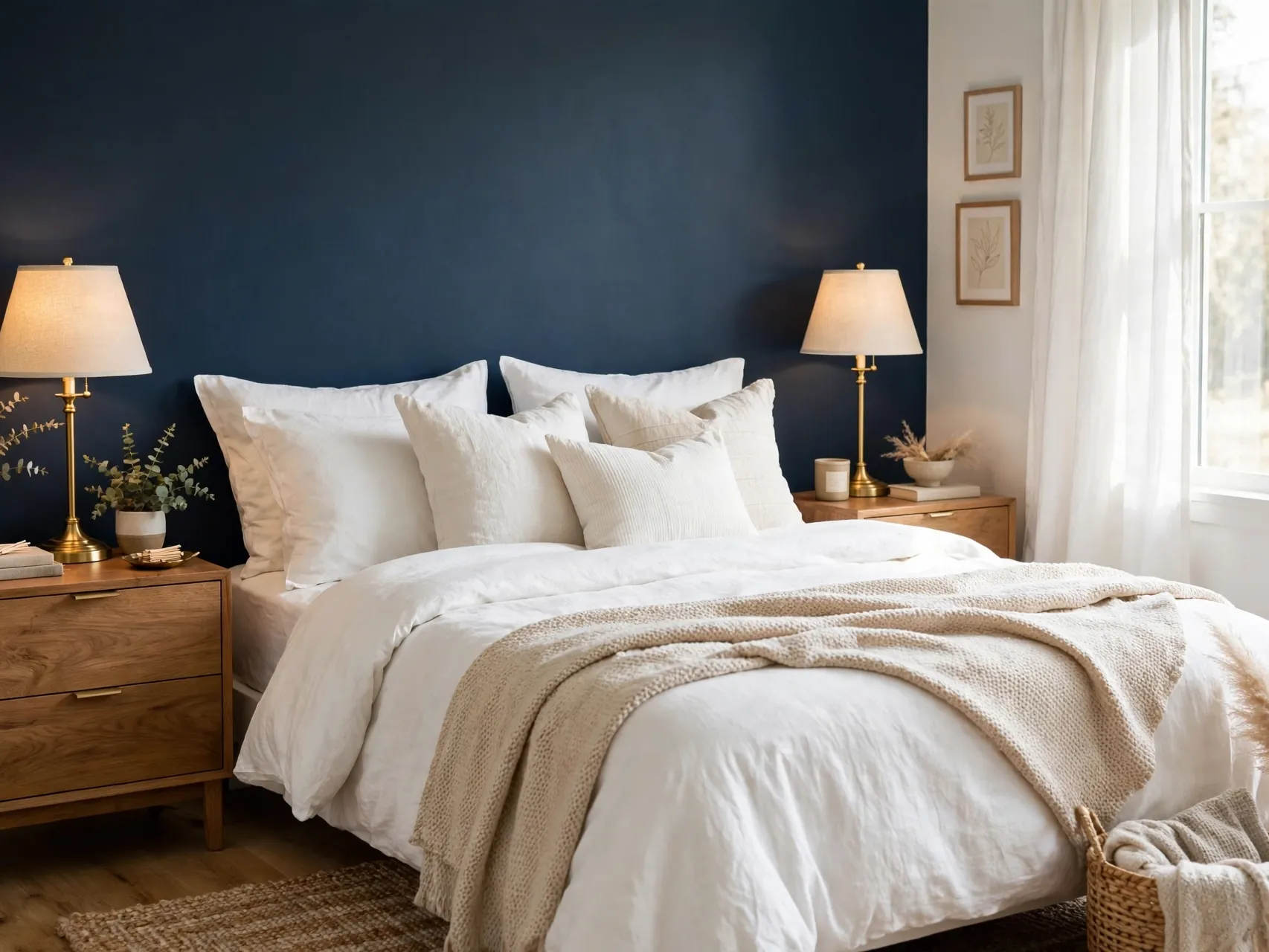
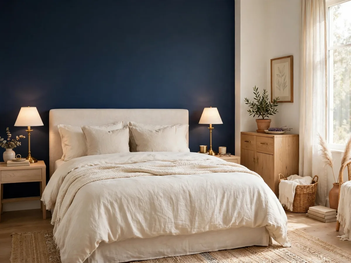
A deep navy wall behind the bed gives the room an instant focal point and makes white or cream bedding look crisp and fresh. Keep the other walls in a warm soft white so the navy reads rich, not heavy, and repeat the blue in one pillow or throw.
Use an eggshell finish for a soft sheen that hides minor marks. Navy suits rooms with decent daylight best. In a darker room, warm the scheme with brass lamps and light wood so the wall feels cozy rather than cold.
2. Sage Green on All Four Walls

Sage green wraps a bedroom in a calm, nature led feeling that pairs beautifully with oak, linen and cream textiles. Painting all four walls the same soft sage creates a cocoon effect that many people find restful, especially with warm white trim for definition.
Sage is forgiving with mixed wood tones and houseplants. Test your sample beside your bedding, because sage can lean grey in north facing light and warmer in sunny rooms. A matte or eggshell finish keeps the color soft and chalky.
3. Two Tone Walls With a Chair Rail Line
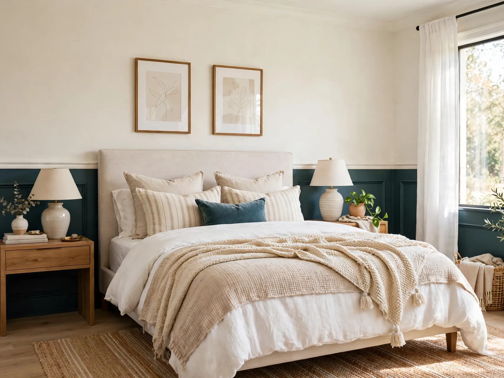
Split the wall horizontally, a deeper tone below and a pale tone above, divided at chair rail height or a taped line about one third up from the floor. The darker base grounds the bed and nightstands, while the light upper half keeps the room airy.
This classic treatment hides scuffs where they happen most, along the lower wall. Use a level and good tape for a crisp line, and paint the line color onto the tape edge first to seal it. It suits traditional and modern rooms alike.
4. Warm White Color Drenching

Color drenching means painting walls, trim and even the ceiling in the same warm white or soft neutral for a calm, wrapped feeling. With no sharp contrast lines, the room feels larger, quieter and more expensive, and texture in bedding and rugs does the decorating.
Choose a white with warm undertones so the room never feels stark. Drenching is also forgiving for uneven trim or older woodwork, because everything blends. Add contrast through wood furniture, black hardware and layered textiles instead of paint lines.
5. Terracotta Half Wall for Earthy Warmth

A terracotta half wall behind the bed brings sunset warmth without overwhelming the room. Paint the lower portion up to just above the headboard height, and keep the upper wall and ceiling in a soft warm white or pale clay tint.
Terracotta loves natural materials: rattan, jute, light wood and cream linen all glow beside it. Keep the line level and crisp. If the color feels strong on day one, live with it for a week, because earthy tones settle beautifully once art and bedding return.
6. Soft Blue Grey for a Restful Base
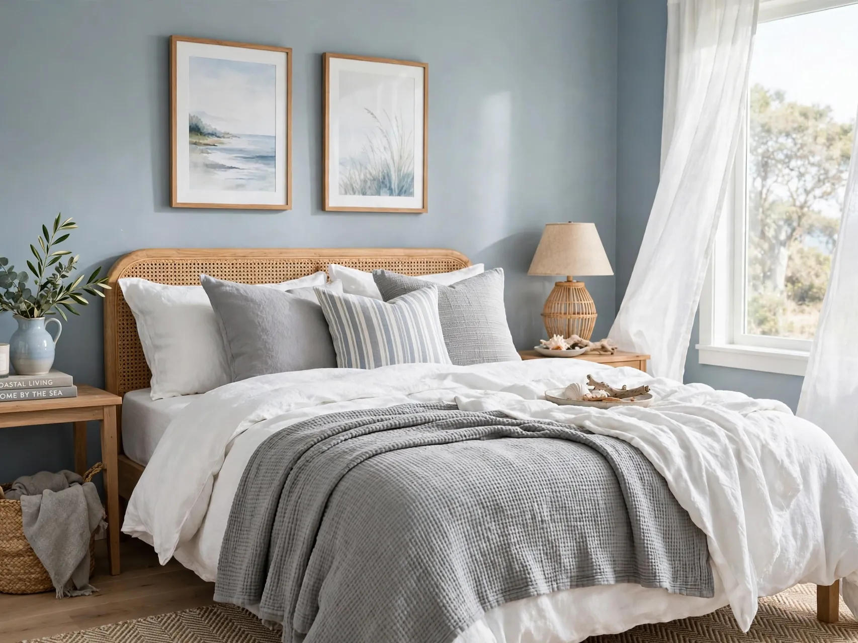
Blue grey is the quiet workhorse of bedroom paint colors, cool enough to feel fresh and grey enough to stay calm. It pairs with white bedding, silver or black hardware, and both light and dark wood, which makes it an easy long term choice.
In sunny rooms blue grey stays serene. In low light rooms it can lean chilly, so warm it with cream textiles, warm bulbs and a wood headboard. An eggshell finish keeps the tone soft while staying wipeable around light switches and doors.
7. Painted Arch Behind the Headboard
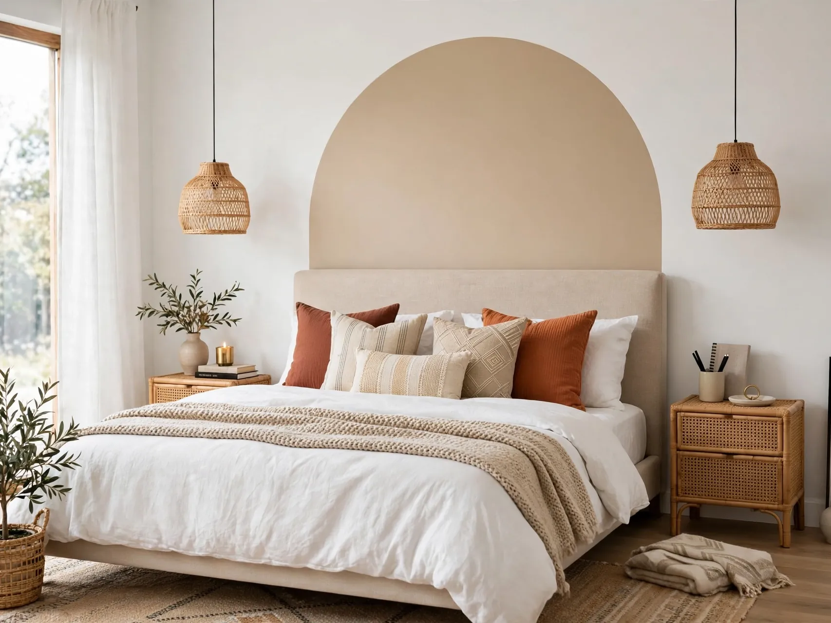
A painted arch behind the bed creates the look of a custom headboard zone for the cost of a sample pot. Mark the arch with a pencil, string and a steady hand, or use a flexible curve guide, then fill it in a tone deeper than the main wall color.
Center the arch on the bed, and make it a little wider than the mattress for a generous frame. Tone on tone arches feel modern and calm. A contrasting arch in clay, sage or dusty blue feels playful and photographs beautifully for Pinterest boards.
8. Limewash Look With Cloudy Texture
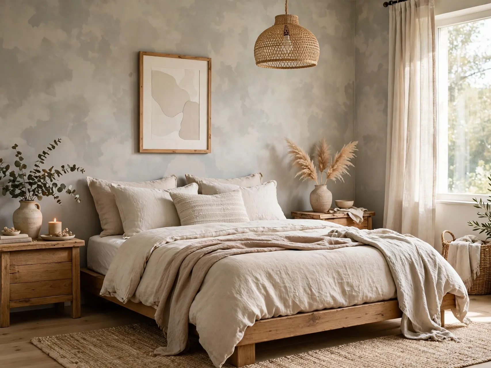
Limewash style paint gives walls a soft, cloudy movement that plain flat paint cannot match. Applied with a large brush in loose cross strokes, it adds depth and an old world calm that suits linen bedding and simple furniture perfectly.
Real limewash and limewash effect paints both need test areas, because the color dries lighter and the texture varies by hand. Keep the rest of the room simple so the wall texture stays the star. This finish hides minor wall flaws kindly.
9. Charcoal Wall for a Moody Retreat
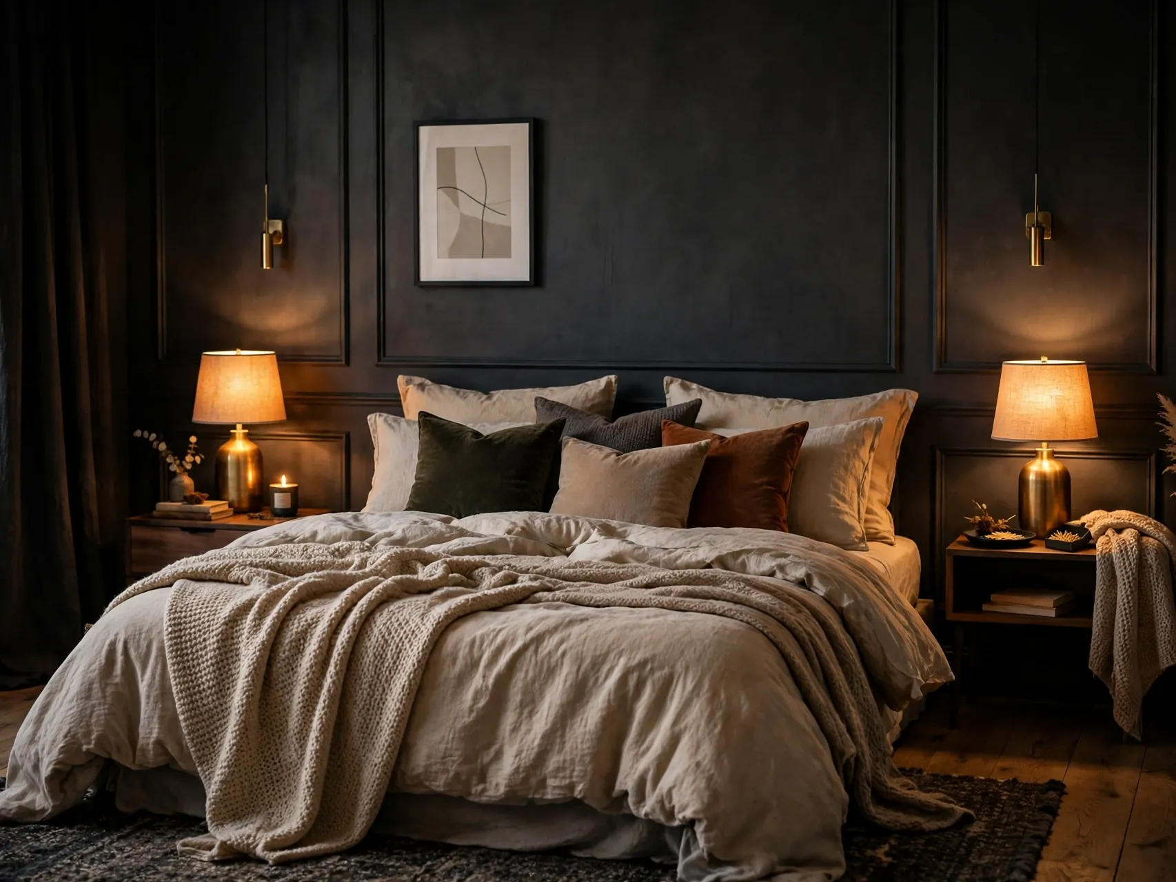
One charcoal wall turns a plain bedroom into a moody retreat, especially behind a light wood or upholstered bed. Charcoal is softer than black and pairs with warm whites, camel throws and brass or black lighting for a boutique hotel feeling.
Balance is everything: keep bedding light, add a pale rug, and use warm lamps on both sides of the bed. In small rooms, limit charcoal to one wall and keep the ceiling bright so the room still breathes.
10. Blush Pink Kept Grown Up

Blush pink reads grown up when it is dusty, muted and paired with serious partners like charcoal, walnut and cream. Paint all walls in a soft blush for a warm glow, or use it on one wall with warm white elsewhere for a gentler step.
Avoid sweet results by skipping frilly extras and choosing clean lined furniture. Blush flatters skin tones in mirror light, which makes it a kind pick for a dressing corner. Eggshell keeps the color luminous without shine.
11. Geometric Color Blocks With Tape

Geometric blocks, rectangles, triangles or a large circle, add art scale pattern using only tape and two or three paint colors. Plan the design on paper first, keep the palette tight, and let plenty of the base wall color show so the room stays restful.
This is a strong choice for a teen room, a guest room or a plain rental style space you own. Remove tape while the final coat is still slightly wet for the cleanest lines. Keep bedding simple so the wall stays the artwork.
12. Olive Green for a Grounded, Organic Feel

Olive green brings the grounded calm of nature indoors and pairs beautifully with cream, tan leather, black metal and warm wood. It feels a little moodier than sage, which suits master bedrooms that want depth without going dark.
Use olive on all walls for a cocoon, or on the bed wall only with warm white elsewhere. Houseplants echo the color and make the scheme feel alive. Test carefully, because olive undertones swing yellow or grey depending on your light.
13. Paint the Ceiling a Soft Contrasting Tone

A painted ceiling, often called the fifth wall, changes a bedroom in the most surprising way. A soft blue, pale blush or warm greige on the ceiling lowers the visual height slightly and makes the room feel intimate and finished.
Keep walls lighter than the ceiling color for balance, unless you are fully drenching. This idea suits rooms with plain, smooth ceilings best. Use ceiling rated paint and careful edging, and let the bedding pick up a hint of the ceiling tone.
14. Cream and Beige Layered Neutrals
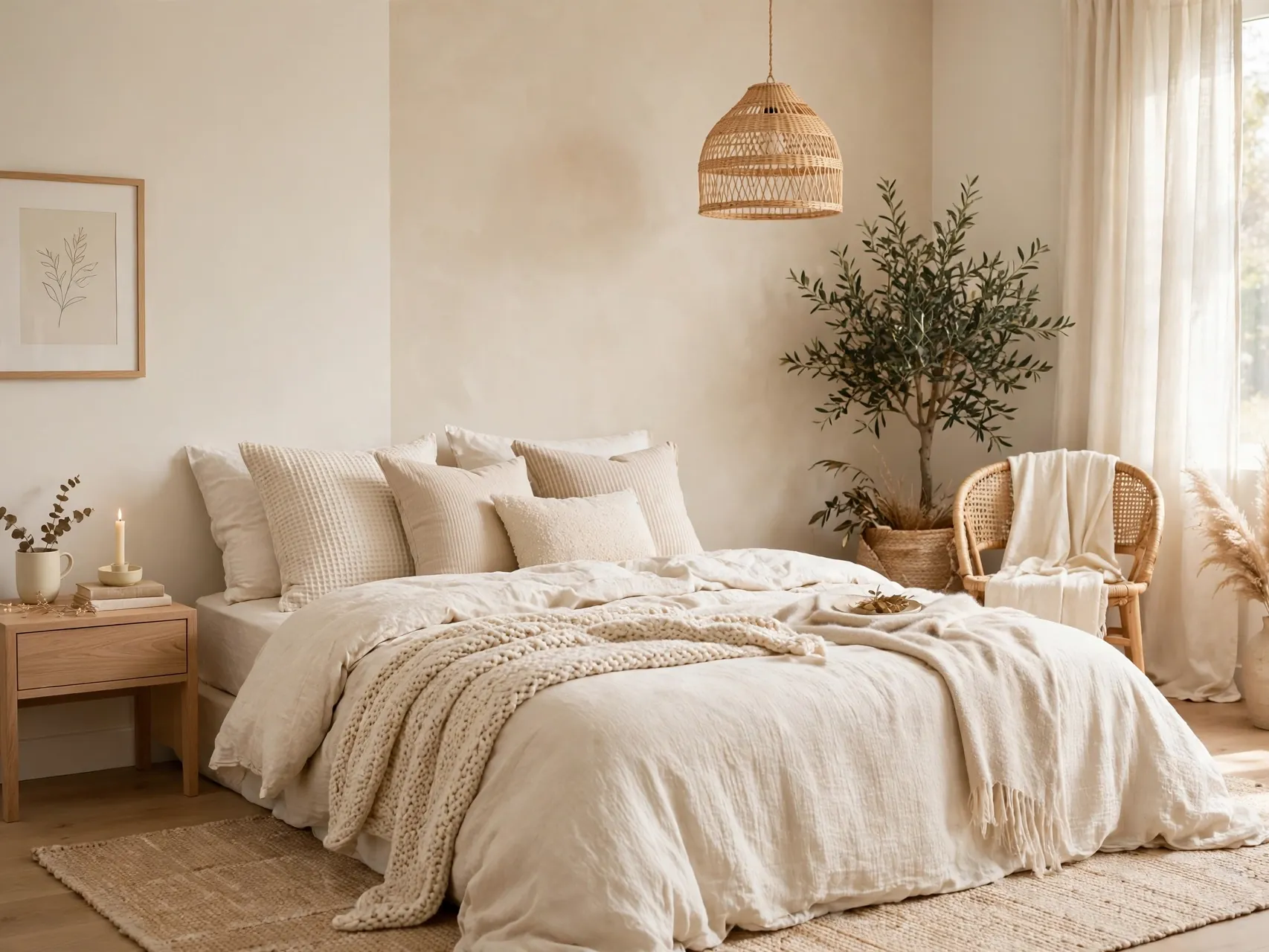
Layering cream walls with slightly deeper beige trim, or the reverse, creates a soft neutral room with real depth. The trick is undertone harmony: keep both colors warm, and let texture from linen, wool and wood supply the contrast that paint does not.
This scheme is ideal if you change bedding with the seasons, because everything works over a calm neutral base. Add one stronger accent, a clay throw or a black frame, so the room feels designed rather than washed out.
15. Forest Green Bed Wall With Brass Accents

A forest green bed wall feels rich and restful, like sleeping in a quiet woodland clearing. Pair it with warm white side walls, cream bedding and brass lamps or frames, and the green reads elegant instead of heavy.
Forest green loves warm light, so choose warm bulbs and light the wall with bedside lamps in the evening. Keep the green to one wall in smaller rooms. A wood headboard bridges the green and the bedding beautifully.
16. Horizontal Stripe for Width
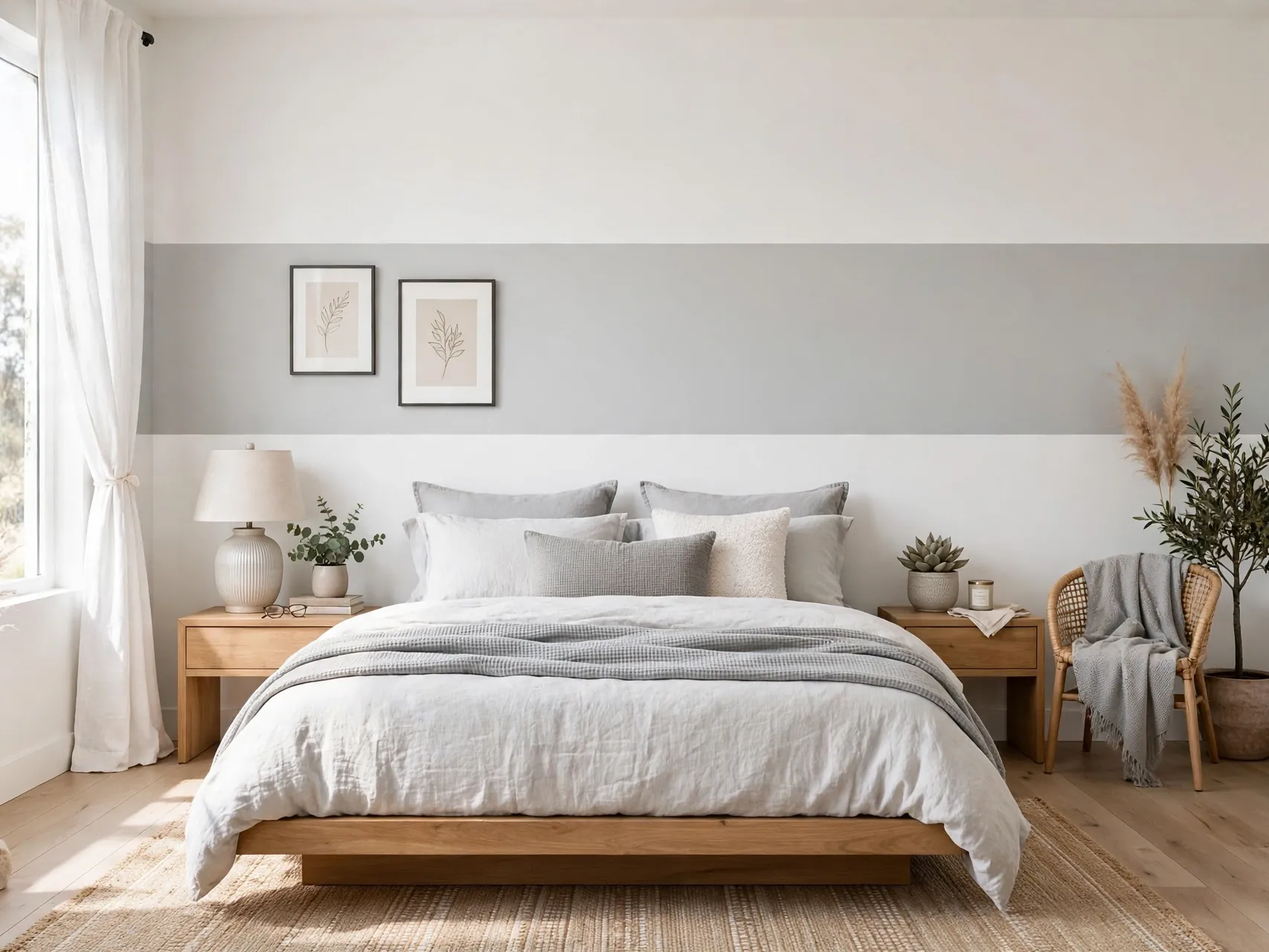
One wide horizontal stripe, painted at headboard height around the room or just behind the bed, visually widens a narrow bedroom and adds tailored detail. Keep the stripe in a tone close to the wall color for subtlety, or use a clear contrast for a bolder look.
Measure and level with care, because a sloping stripe cannot be unseen. This treatment suits modern rooms with simple furniture. Repeat the stripe color in a cushion or a bench fabric so the line feels intentional, not random.
17. Dusty Rose and Grey Balanced Pairing
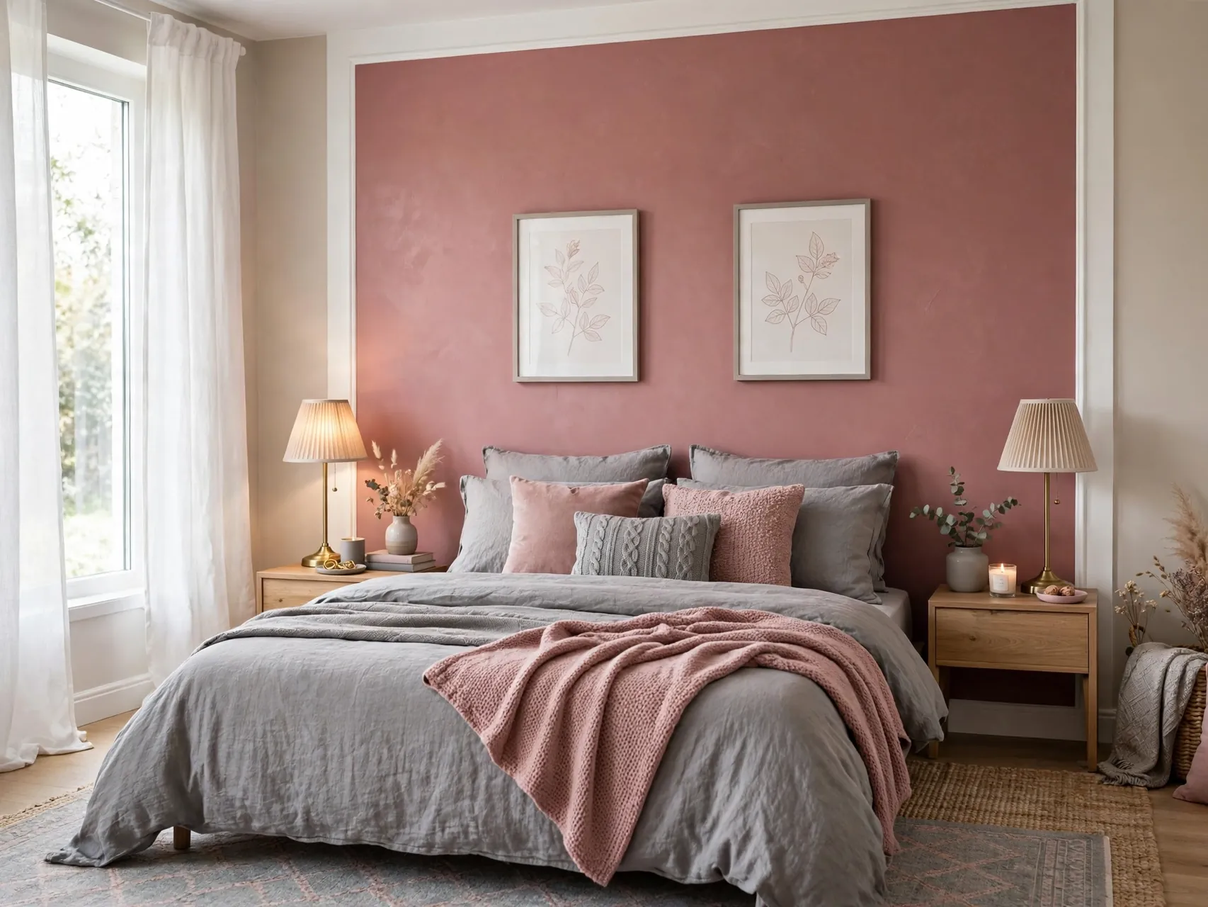
Dusty rose with soft grey is a balanced pairing that feels romantic without being sugary. Use grey as the main wall color and rose on the bed wall, or reverse it in a bright room. White bedding keeps the pair fresh and clean.
Choose a grey without blue undertones if your rose is warm, to avoid a clash. This combination suits guest rooms especially well, because it feels welcoming to almost everyone. Add silver or black frames to sharpen the softness.
18. Warm Greige for a Flexible Background

Greige, the blend of grey and beige, is the flexible friend of bedroom color painting ideas. Warm greige walls work with cool and warm textiles, suit north and south light better than pure grey, and hide the scuffs of daily life kindly.
Paint all walls greige, keep trim in a clean warm white, and change the room mood with bedding alone. For depth, paint the bed wall one shade deeper in the same family. Sample carefully, because greige undertones vary widely between brands.
19. Ombre Fade From Light to Deep

An ombre wall fades from a pale tone at the top to a deeper tone at the base, blending in the middle with a dry brush or sponge while the paint is wet. Blue, sage and blush ombres all suit bedrooms, and the effect feels artistic yet calm.
This technique rewards patience and practice boards. Work in sections, keep a wet edge, and step back often. Keep furniture and bedding simple and pale so the gradient stays the focus. One ombre wall per room is plenty.
20. Black Accent Details on a Pale Wall
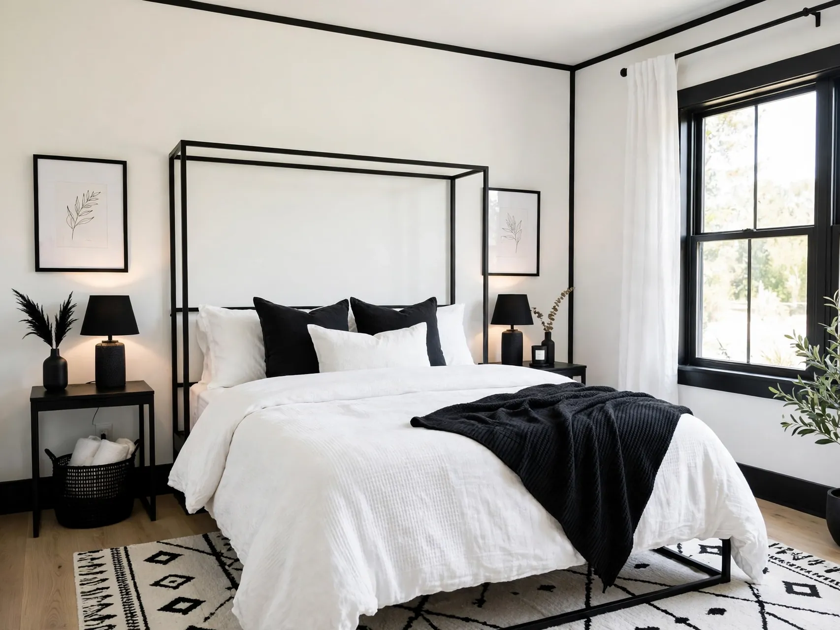
If a full dark wall feels too much, paint black details instead: a thin border frame behind the bed, a painted headboard rectangle, or black trim and doors against pale walls. The graphic contrast looks sharp and modern with very little paint.
Use a true soft black rather than the harshest black for a kinder result. Repeat black in lamp bases, frames or a bench so the detail connects. This idea suits small rooms, because the walls stay light while the design still feels bold.
21. Sample Board System Before You Commit
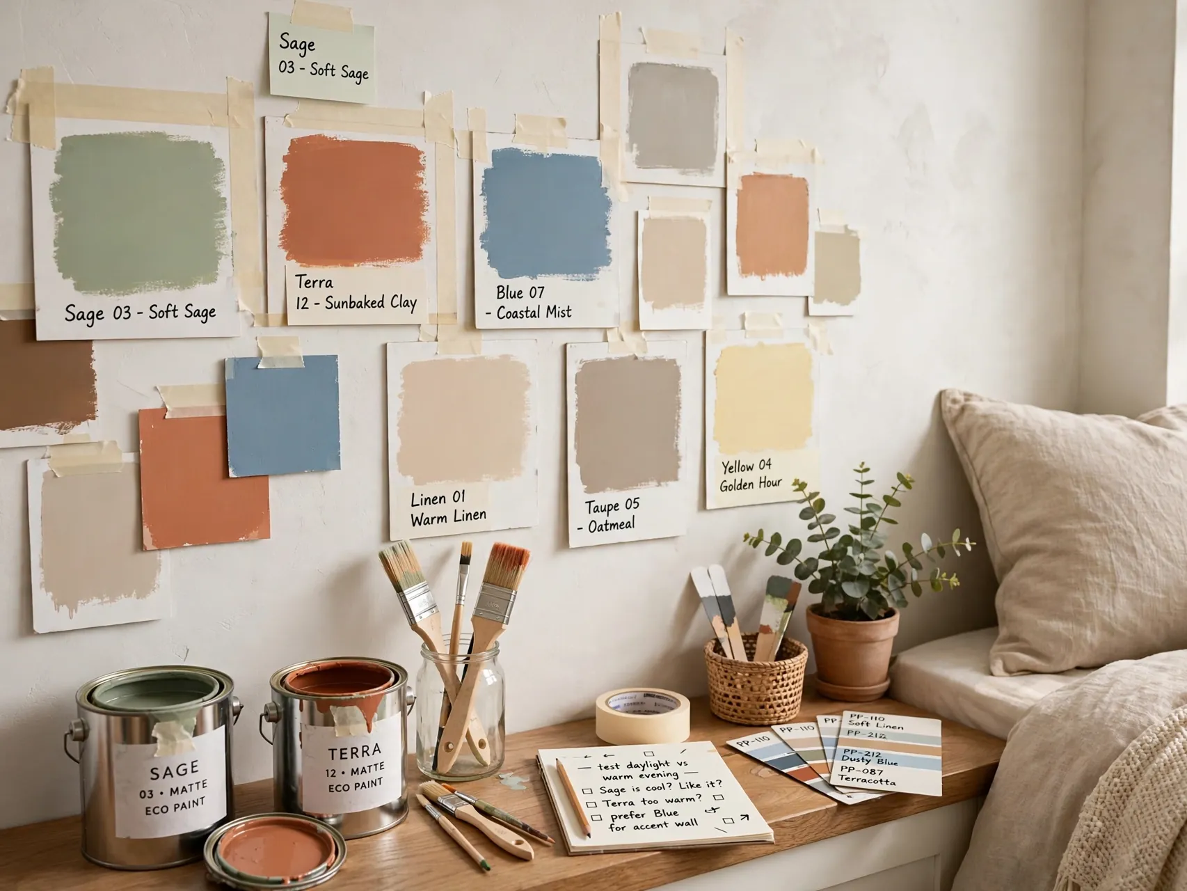
The most transformative idea is a system, not a color: paint large foam boards in two or three finalist shades, tape them to different walls, and live with them for two full days of changing light. Note how each looks at wake up time and at bedtime.
Check samples against your flooring, bedding and curtains, not in isolation. Choose the color that feels right at the hours you actually use the room. This simple habit prevents the most common paint regret and makes every other idea in this list work better.
FAQ
What is the best paint finish for bedroom walls?
Eggshell is the most popular choice for bedrooms because it has a soft, low sheen, hides minor wall flaws, and wipes clean more easily than flat paint. Matte can look beautiful on smooth walls in low traffic rooms. Save satin and semi gloss for trim, doors and furniture, where extra durability and shine help most.
How do I test bedroom paint colors properly?
Paint large sample boards or generous swatches on at least two walls, and look at them in morning, afternoon and evening lamplight for two days. Hold bedding and curtain fabric beside the sample. Colors look different at night under warm bulbs, which is when a bedroom matters most, so never choose from a tiny chip alone.
Is dark paint a bad idea in a small bedroom?
No, dark paint can make a small bedroom feel cozy and intentional, especially on one wall with light bedding and good lamps. The key is balance: keep the ceiling and at least the bedding pale, add warm light on both sides of the bed, and avoid dark colors on every surface including furniture and curtains at once.
How can I paint a bedroom safely?
Ventilate well during painting and drying, take breaks for fresh air, and choose low or zero VOC paint when you can. Keep paint and tools away from children and pets until fully dry. In homes built before 1978, do not sand or scrape old paint, because it may contain lead. Follow EPA lead safe guidance or hire a certified pro.
What are renter friendly wall paint alternatives?
If you cannot paint, use large scale removable options your lease allows, such as peel and stick panels tested in a hidden spot first, tall fabric panels, or a large tapestry or rug hung behind the bed for a color block effect. If painting is allowed with permission, get it in writing and agree the restore color before you start.
Key Takeaways
- Mood first, color second: Decide how the room should feel at wake up and wind down time, then test large samples in real light for two days.
- One treatment, finished fully: An accent wall, two tone split, arch or drench transforms a room when the prep, coats and edges are done properly.
- Balance dark with light and warm: Deep navy, charcoal and forest green work when bedding stays pale and lamps add warm light on both sides of the bed.
- Undertones decide harmony: Sage, greige, blush and blue grey only work when their undertones agree with your flooring, bedding and light direction.
- Safety is part of the plan: Ventilate, choose low or zero VOC paint where possible, and follow EPA lead guidance for pre-1978 homes without sanding suspect paint.
- Love one of these paint ideas for your bedroom? Save this guide to Pinterest and pin the color you will test this weekend.