24 Paint Ideas for Small Spaces That Make a Big Impact
Introduction
Paint is the fastest change you can make in a compact home, and it is also the easiest one to get wrong. The right paint ideas for small spaces do more than pick a pretty color. They control light, soften hard edges between walls and ceilings, and give a tiny room a clear mood instead of a collection of leftover shades.
Start with light, not with a color fan. Note which way your windows face, how much daylight the room really gets, and where lamps sit at night. Paint makers explain color using LRV, or light reflectance value, a scale from 0 to 100 for how much light a color reflects. Higher values generally feel brighter, which is why sampling matters so much in small rooms.
Use this list as a menu, not a shopping order. Pick one main idea for walls, one supporting idea for the ceiling, trim, or doors, and test both with large samples before you buy gallons.
1. Start With a Warm Off White

A warm off white is the safest starting point for paint colors for small rooms that feel dim or chopped up. Unlike a stark, blue toned white, a warm off white reflects daylight softly and keeps north facing rooms from feeling cold and gray.
Test two or three off whites side by side in morning and evening light, next to your flooring and fabric. Undertones show up strongly on large walls.
2. Choose a Soft Greige for Depth Without Darkness

Greige, a blend of gray and beige, gives a small room more depth than plain white while staying light enough to reflect a good amount of light. It suits living rooms where white feels too stark and gray feels too cool.
Greige is forgiving with mixed wood tones. Keep textiles in cream, white, and one accent color. If your room faces north, lean warmer to balance cool daylight.
3. Try an Airy Pale Blue That Recedes

Pale blue is a classic for small bedrooms and bathrooms because cool colors tend to feel like they recede, which can make walls seem a little farther away. Benjamin Moore color experts make the same point about blues opening up a space.
Choose a blue with a soft gray undertone rather than a bright, icy one. Pair it with warm white bedding and light wood, which stop it feeling chilly in winter.
4. Use Pale Sage Green for a Calm, Natural Feel
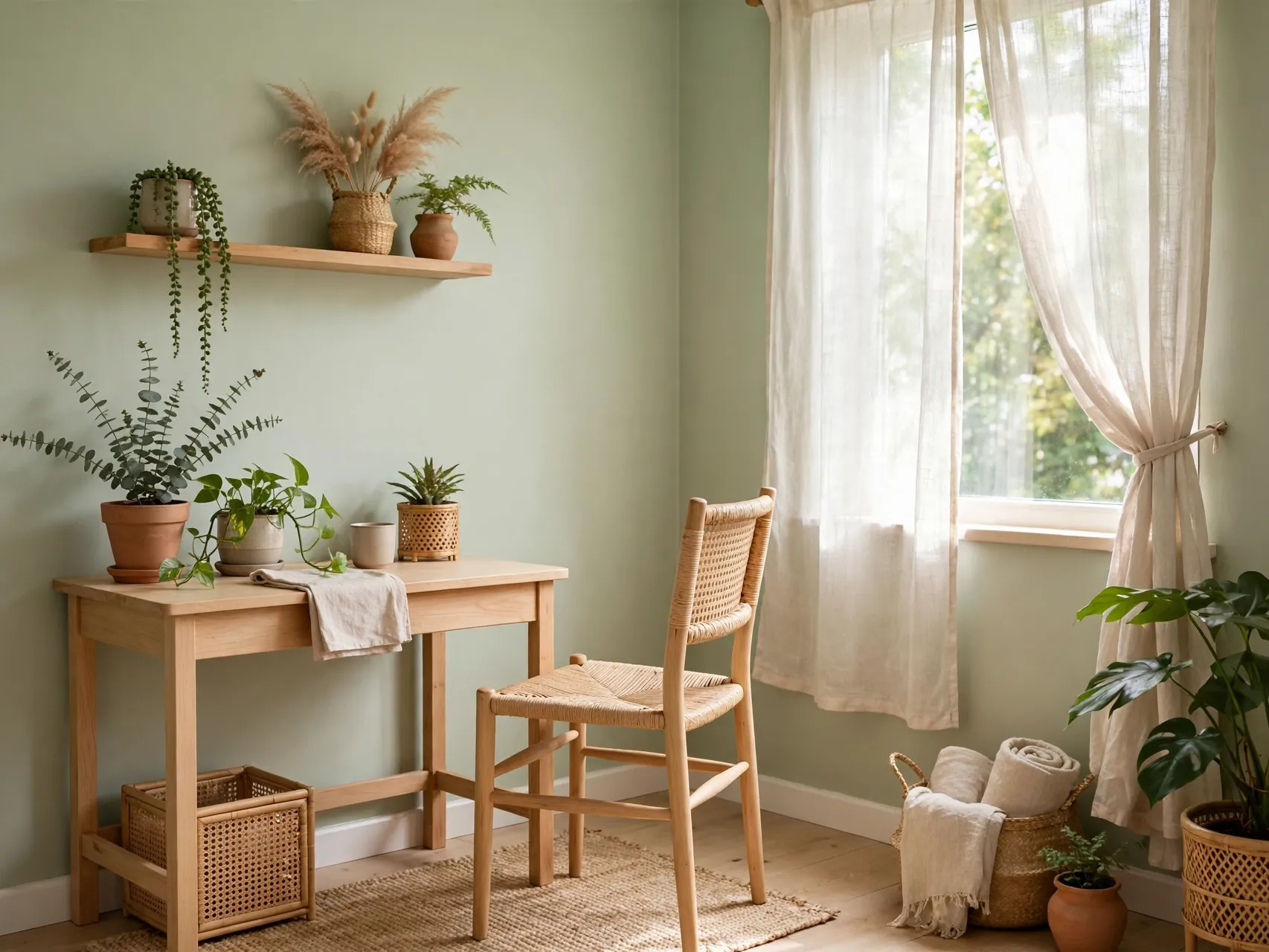
Sage brings the feeling of the outdoors into rooms that may have only one small window. In its pale versions it stays light and reflective, while the green undertone adds life that a plain neutral cannot offer.
Sage works well in small kitchens, bathrooms, and entryways where white feels plain. Repeat it in a plant or towel nearby. Sample carefully, because sage can turn minty in bright southern light.
5. Add a Soft Blush for Warmth in Low Light

A very soft blush or pale peachy pink warms up a small room that gets little sun. It flatters skin tones, which makes it lovely in bedrooms, dressing corners, and small bathrooms where you get ready each morning.
Keep it muted and dusty, paired with cream and natural linen. One blush wall behind the bed is an easy first step if full blush feels like too much.
6. Color Drench the Room in One Shade
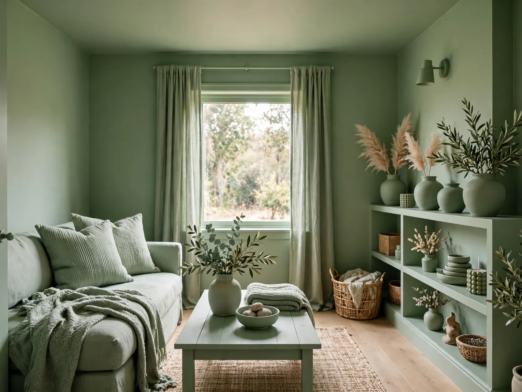
Color drenching means painting walls, trim, and often the ceiling in the same color, sometimes in different finishes. When the hard lines between surfaces disappear, your eye stops measuring the room, and a boxy small space can feel larger and calmer.
This is one of the boldest small room paint ideas for a bedroom. Choose a mid tone you love, use a washable finish on walls, and test the ceiling color before committing.
7. Build a Monochromatic Scheme in Layers
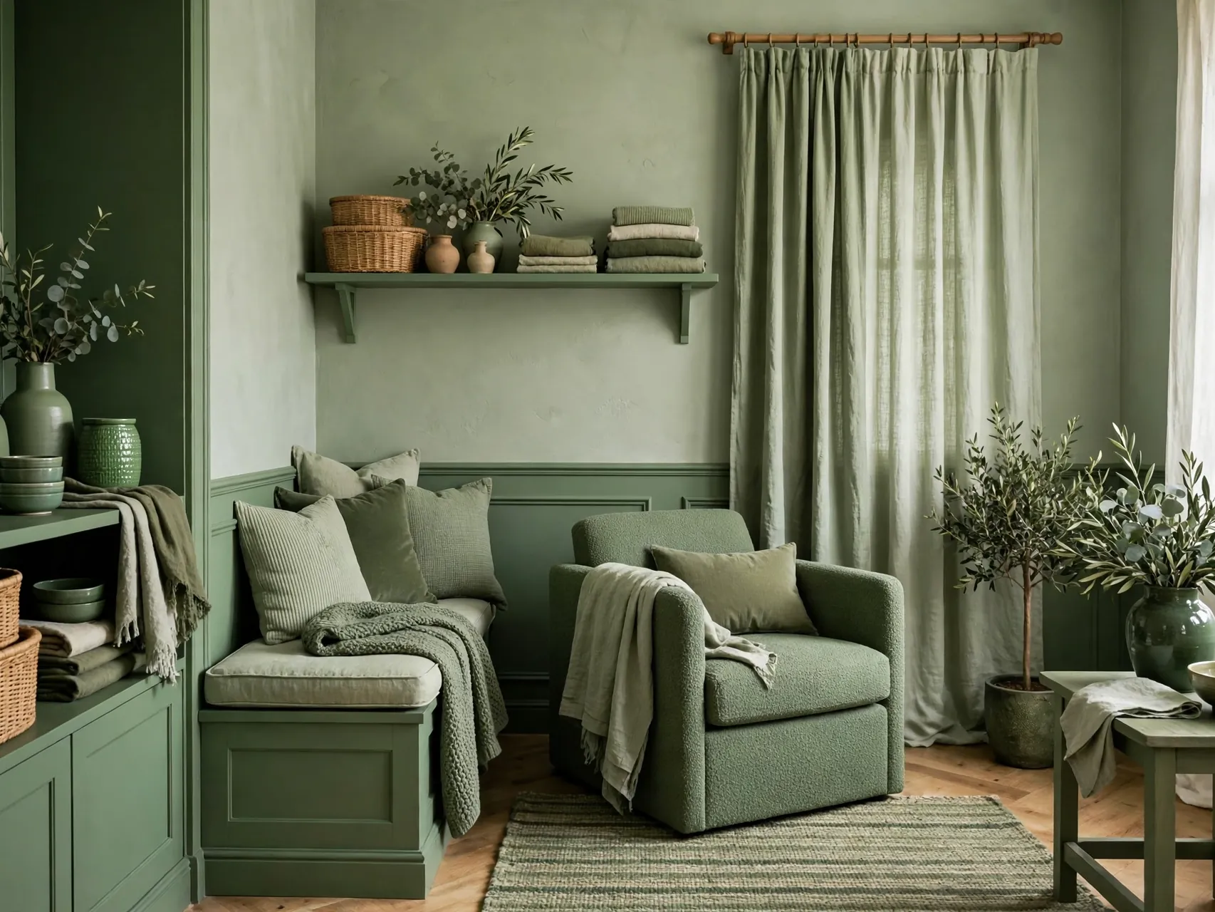
A monochromatic room uses lighter and darker versions of one color family across walls, furniture, and textiles. Without harsh contrasts chopping up the space, the room flows as one calm whole, which is exactly what a small footprint needs.
Start with walls in the middle, trim a step lighter, and cushions a step darker. Texture keeps it interesting: matte walls, satin trim, linen, and wood.
8. Paint the Ceiling a Lighter Shade Than the Walls

A ceiling that is lighter than the walls draws the eye upward and makes low rooms feel taller. A clean, soft white ceiling is the classic choice over light or mid tone walls, and it reflects lamp light back down in the evening.
If walls are white, the same white in a different finish still counts. The sheen difference separates the planes without a color line.
9. Match the Ceiling to the Walls to Blur the Edges

The opposite ceiling trick also works. Painting the ceiling the exact color of the walls removes the bright horizontal line where wall meets ceiling, so the room edges blur and the space feels less like a measured box.
This suits rooms with slopes or beams you would rather soften. Keep bedding, rugs, and curtains lighter so the room still has contrast.
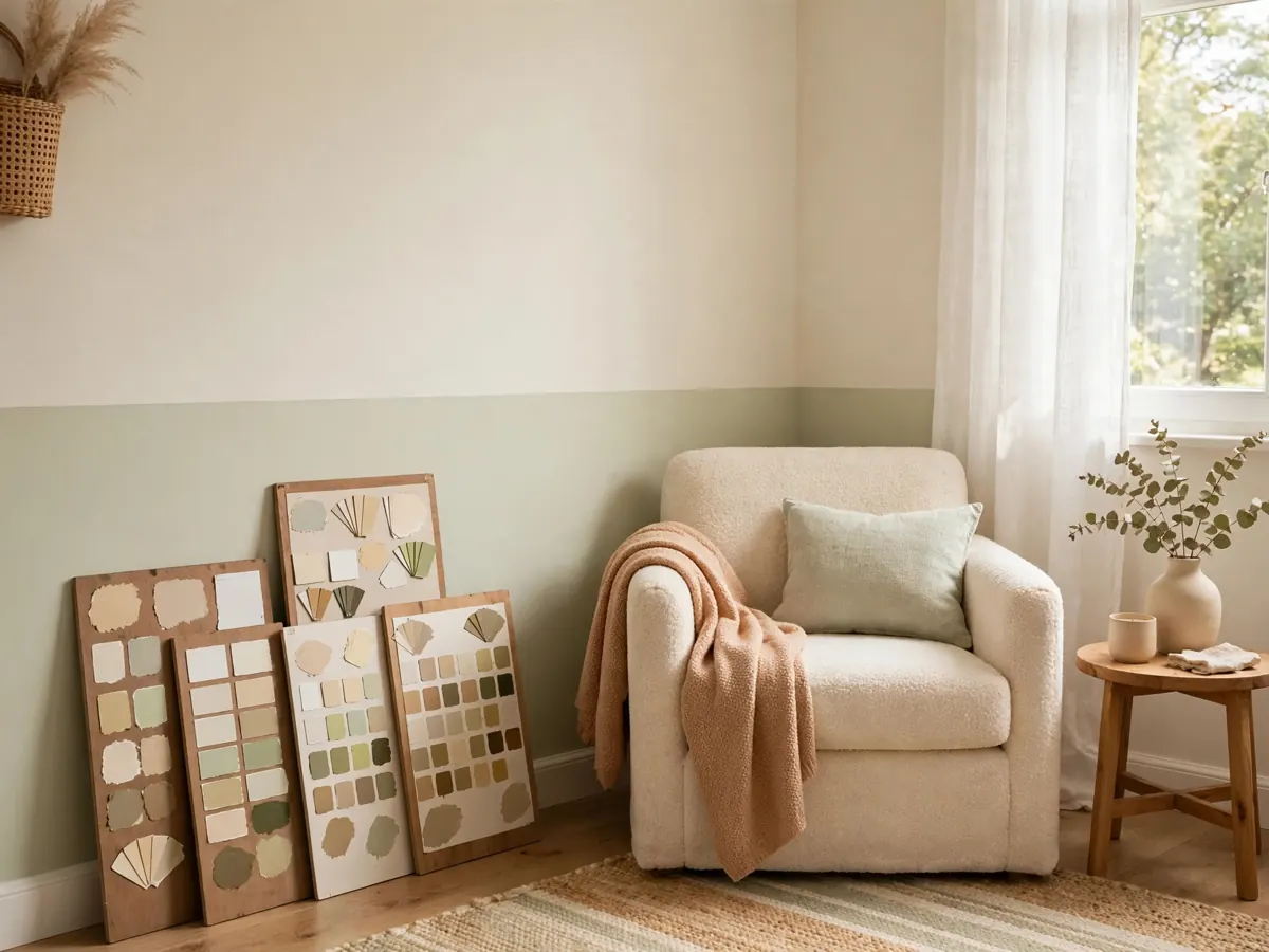
10. Paint a Half Wall for a Two Tone Effect

A two tone wall, darker or more colorful on the lower half and light on the upper half, adds design without covering the whole room in color. The light upper section keeps the room bright, while the lower band grounds furniture and hides scuffs.
Run the line at chair rail height, or at headboard height for a built in look. A crisp tape line is essential, so mask carefully.
11. Put One Accent Wall on the Far Wall

A single accent wall gives a small room a focal point and a sense of depth, especially when it is the wall you see across the room. Benjamin Moore experts suggest using a brighter or deeper color as a focal point and keeping the other walls lighter.
Choose the wall behind the sofa or bed. Repeat the accent in two small accessories so it feels connected. In a long, narrow room, an accent on a short end wall changes how proportions read.
12. Add Subtle Vertical Stripes to Lift the Eye

Soft vertical stripes, painted in two close tones of the same color, nudge the eye upward and make ceilings feel higher. Because the tones are close, the effect reads as texture from across the room rather than a circus pattern.
Use tape and a level, and keep stripes fairly wide. Alternating matte and satin versions of one color gives stripes with just a gentle sheen shift. This is a pretty how to paint a small room trick for an entry.
13. Paint the Inside of Shelves and Bookcases

Painting the back panel inside a bookcase, hutch, or built in adds color in a controlled dose. The room stays light, but shelves gain depth, and white dishes, books, and plants stand out beautifully against the deeper background.
Pick a color already in your room and repeat it inside the shelves. It is a one afternoon project, perfect for testing a bolder color.
14. Paint Interior Doors in a Bold Color

A bold door turns a plain hallway or tiny entry into a designed moment without painting a single wall. Deep green, navy, warm red, or even black on a door looks intentional because the door is a natural frame with trim around it.
Use a durable trim finish and follow maker directions for prep. A bold door is also a smart test: live with the color small before using it big.
15. Paint Trim to Match the Walls for a Seamless Look

Bright white trim on colored walls creates a strong outline that can make a small room feel boxed in. Painting trim the same color as the walls softens that outline and lets the wall color flow around the room without interruption.
Use satin or semi gloss on trim while walls stay matte or eggshell. Light catches the trim differently, so detail remains. It works with pale neutrals and deeper shades alike.
16. Use a Glossier Finish Where Light Needs Help

Finish changes how much light bounces around a room. Flat and matte finishes absorb more light and hide wall flaws, while satin and semi gloss reflect more light and are easier to wipe clean. Neither is right everywhere, so place them on purpose.
Consider satin in a busy kitchen or hallway, eggshell in living spaces, and semi gloss on trim. Always check the maker label, because finish names vary by brand.
17. Go Dark and Cozy in a Tiny Powder Room

A tiny powder room or windowless bathroom is the one place where dark paint often beats light paint. With no window to disappoint, a deep color turns the small size into the point: a jewel box room that feels deliberate and fun.
Balance dark walls with a light sink, a bright mirror, and good lighting. Sample on all walls, because small rooms show undertones strongly.
18. Paint Kitchen Cabinets Light Above and Deep Below

In a small kitchen, two tone cabinets give you color without darkening the whole room. Light upper cabinets keep the eye level zone bright and open, while a deeper color on lower cabinets grounds the room and hides everyday marks better.
Prep is everything: clean, sand as directed, prime, and allow drying between coats. Choose paint made for cabinets for a harder finish. It is a high impact best paint colors for small spaces project.
19. Paint a Bulky Piece the Same Color as the Wall
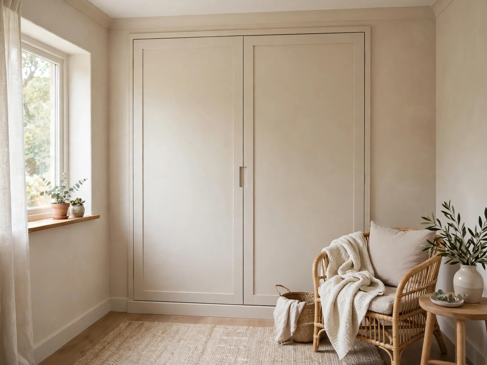
A large wardrobe, radiator cover, or bookcase painted to match the wall behind it nearly disappears. Your eye reads the wall color, not the object, so the room feels less crowded even though nothing was removed.
This works best on a piece that sits flat to the wall with simple lines. Use the proper primer, especially on laminate or metal.
20. Try a Limewash or Soft Texture Finish
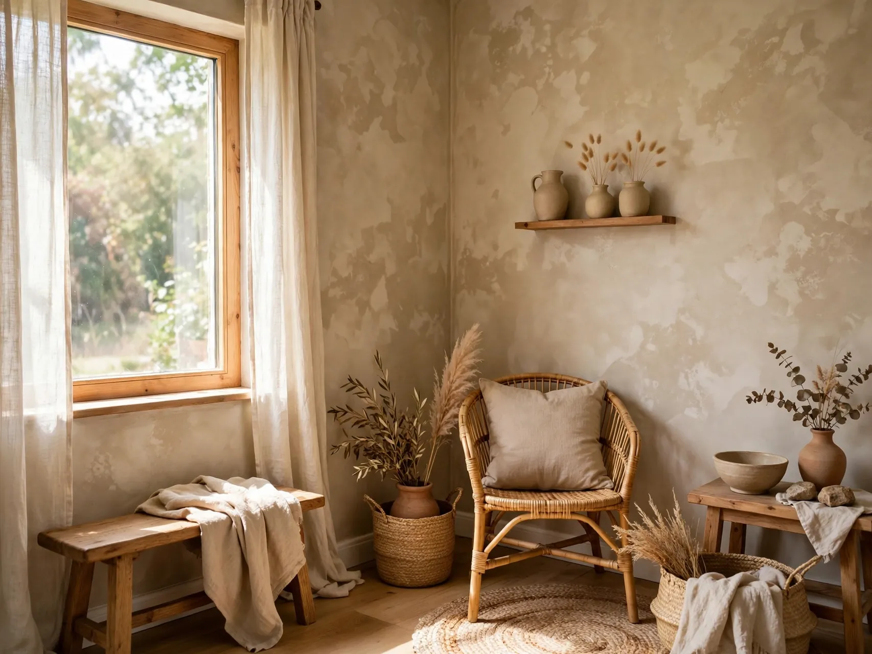
Limewash and similar soft, cloudy finishes add movement to plain walls without pattern. In a small room, that gentle variation keeps large light walls from feeling flat or stark, especially in natural light that changes through the day.
These finishes need the right primer, so read product instructions and practice on a board first. Keep the color pale for an airy effect.
21. Paint a Reading Nook or Alcove in a Deeper Shade

Small homes often have odd corners: a window alcove, a space under stairs, or a wide closet that lost its doors. Painting that nook one or two steps deeper than the main room defines it as a place with a purpose.
Add a cushion, a lamp, and a shelf, and a wasted corner becomes the favorite seat in the home. Keep main walls light so contrast stays clear.
22. Use Color Blocking to Zone a Studio or Open Plan
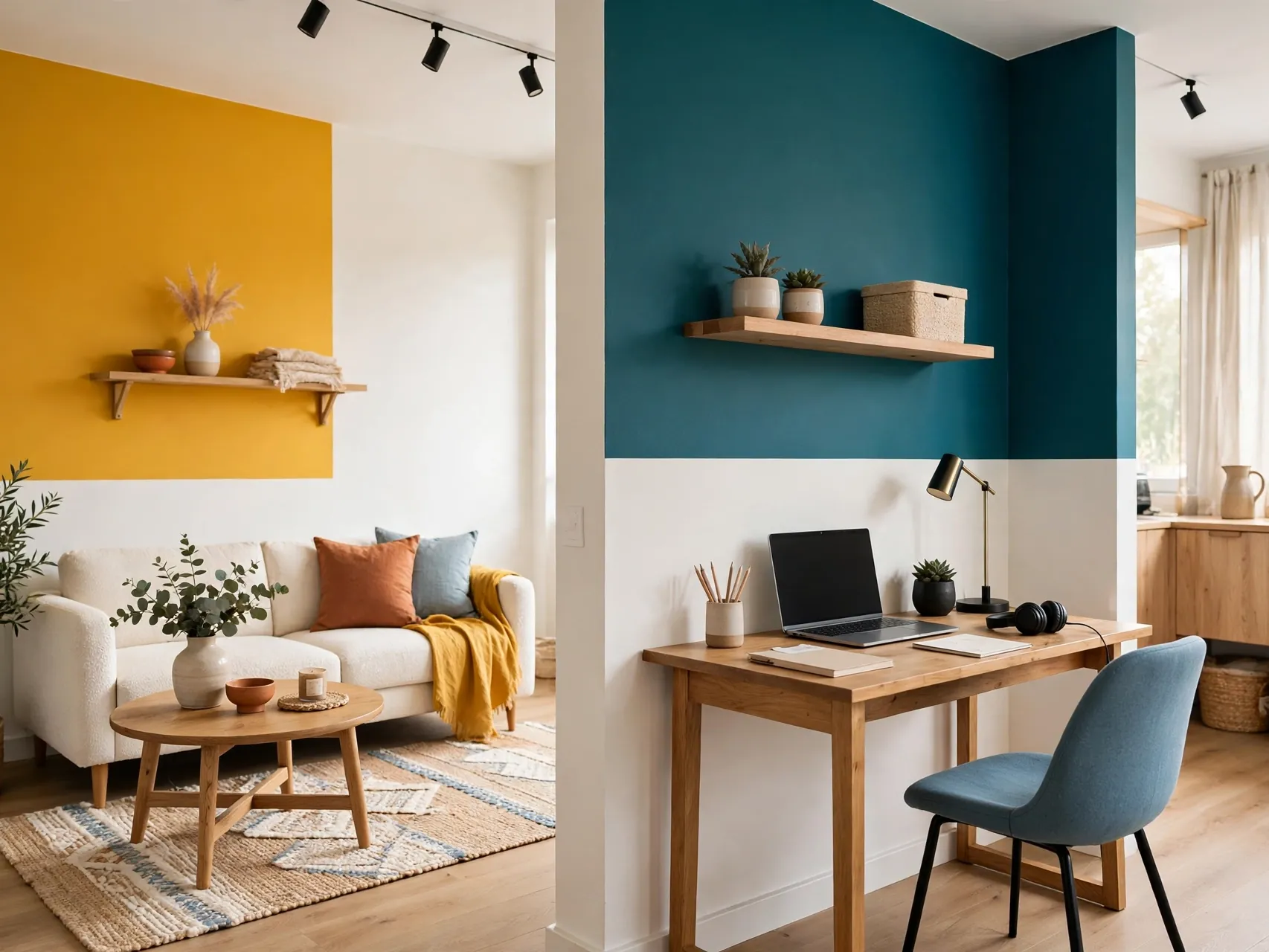
In a studio or open plan small home, paint can do the work of walls. A soft color block behind the bed marks the sleeping zone, another behind a desk marks work, and the living area stays neutral. The room feels organized without any dividers taking floor space.
Keep block colors in the same family so zones connect. Simple shapes work best: a rectangle behind a headboard or an arch behind a desk.
23. Warm Up a Narrow Hallway With a Soft Glow Color

Hallways are small spaces people forget, yet you pass through them all day. A soft, warm light color on hallway walls, with doors and trim in a clean white, makes the whole home feel brighter because the hallway connects every room.
If there is no window, check the color under your actual bulbs. Add a mirror or glass framed art to bounce a little more light.
24. Sample Like a Pro Before You Paint Anything

The most important paint idea is not a color, it is a routine. Buy sample pots or peel and stick samples, put the color on at least two walls, and live with it for a full day and night. Colors look different beside a window and in a dark corner of the same room.
Write the color name on tape inside a door so touch ups match. Careful sampling is the difference between paint ideas for small spaces that work and a room you repaint in a month.
FAQ
What color makes a small room look the biggest?
Light colors with higher LRV, like warm off whites, pale grays, and airy blues, reflect more light and usually make a room feel largest. The effect is stronger when walls, trim, and ceiling stay close in tone so there are fewer hard edges. Sample in your own light, because a bright color in a dark room can still look dull if the undertone is wrong.
Is dark paint ever a good idea in a small space?
Yes. Dark paint works well in a powder room, a cozy bedroom, or a single nook, especially when the goal is mood rather than maximum brightness. Balance it with lighter bedding or fixtures, a pale rug, and layered lighting. The key is intention: dark everywhere with no contrast and no light is what makes a room feel like a cave.
What paint finish is best for small rooms?
Eggshell and satin are popular for walls because they reflect a little light and are easier to clean than flat finishes. Semi gloss is common on trim and doors. In a low light room, a slightly glossier wall finish can help bounce light, but it will also show wall flaws more, so prep and maker guidance matter.
Should the ceiling be lighter or the same color as the walls?
Both can work. A lighter ceiling makes a low room feel taller, while a ceiling matched to the walls blurs the edge between them and can make a boxy room feel larger and calmer. Choose lighter for height, matched for softness, and test the combination with samples before painting the whole room.
How do I test paint colors without painting the whole wall?
Use large peel and stick samples or paint sample boards you can move around. Place them on different walls, beside furniture and flooring, and check them in morning, afternoon, and lamp light. Never judge a color from a tiny swatch or a phone photo alone, because undertones shift a lot with light and scale.
Key Takeaways
- Light is the real tool: Choose colors by LRV and by the daylight your room actually gets, not by a photo taken in a different home.
- Edges change size: A lighter ceiling adds height, while matched walls, trim, and ceiling blur edges and calm a boxy room.
- Use color in doses: Accent walls, doors, shelf backs, cabinets, and nooks give impact without darkening the whole space.
- Finish counts: Satin and semi gloss reflect more light and clean more easily, so place finishes deliberately by room and surface.
- Dark can be right: A tiny powder room or reading nook in a deep shade feels intentional when balanced with light fixtures and textiles.
- Love a color but scared to commit? Pin this guide to your small spaces board on Pinterest, then start with a door or a shelf back this weekend.